YOU ARE VISITING THE
PAPILLON Flower Bouquets
A mobile app design for a florist in Paris


Project overview
The product:
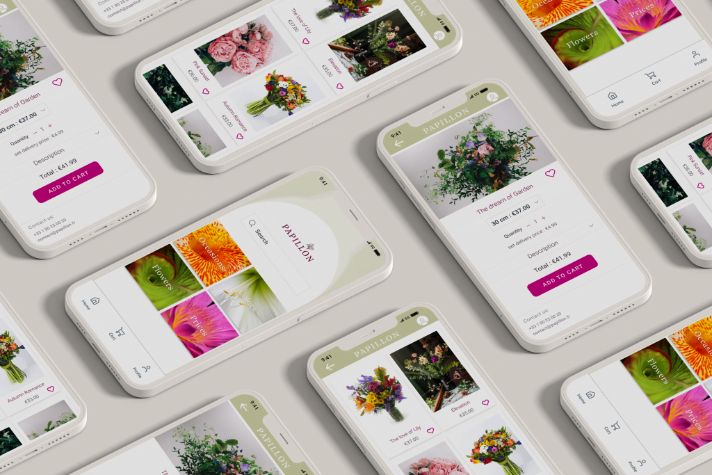
Papillon is a flower shop located in Paris. It delivers fresh, specialty flower bouquets. Papillon targets customers like workers who lack the time or ability to buy and give flowers for their beloved ones in-person.
Project duration:
October 2021 to January 2022
THE PROBLEM:
Busy Parisian workers and commuters lack the time to buy flowers for their friend and family in-person.
The Goal:
The goal is to create a remarkably better experience for the user by addressing the pain points discovered from research findings, and design an app, so that, it could merge the convenience of online ordering with the pleasure of previewing, buying flowers, and giving them to the beloved ones.
User research: summary
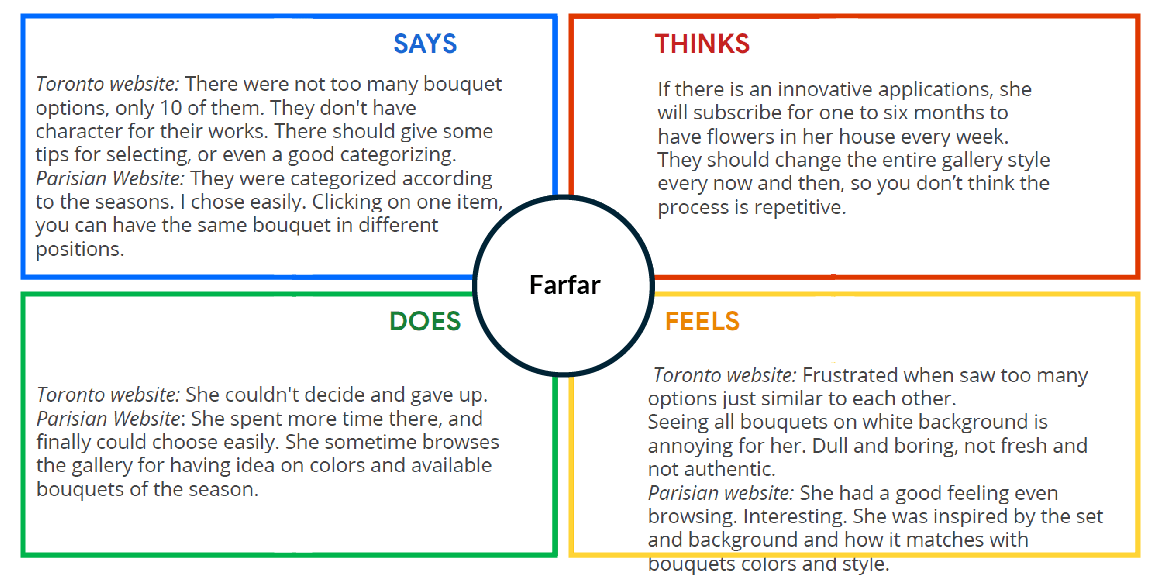
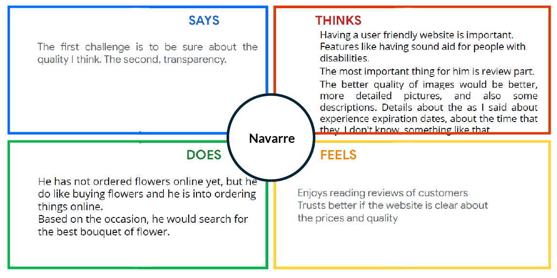
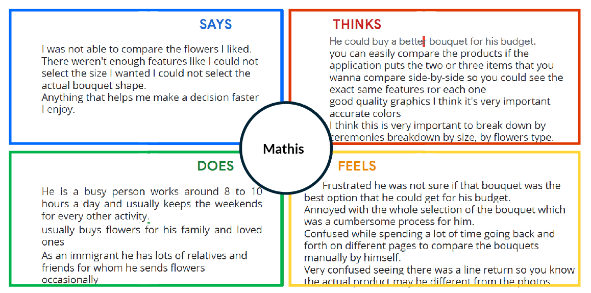
I conducted interviews and created empathy maps to understand the users and their needs I am designing for. A primary user group identified through research was working adults who don’t have enough time buying flowers in person.Before conducting research, I assumed that people would enjoy buying flowers in-store and the factor they choose online shopping is time pressure. Research was agree with my assumptions. However, it it also revealed time was not the only factor limiting users from buying flowers in person. All participants had at least one nice flower shop in their neighborhood, but it does not solve their need or desire. In most cases the user problems included obligations, interests, or challenges that make it difficult to deliver the flower to the person they’ve bought it for.
Empathy maps
Creating empathy maps helped me sort out the information from user research, deepen the empathy and reveal patterns.
User research: pain points
Time
Working adults living in populated cities are too busy to shop flowers in-store
Accessibility
Platforms for ordering flowers are not equipped with assistive technologies.
Information Architecture (IA)
- Galleries with so many bouquets similar to each other makes the user confused.
- There should be various categorizations for bouquet selection.
Assurance
Users like to assure that the bouquet their friends receive is just the same as the one they ordered online
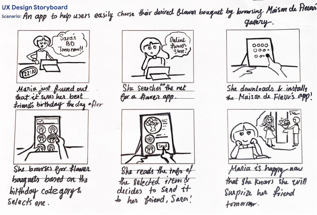
Big picture storyboard
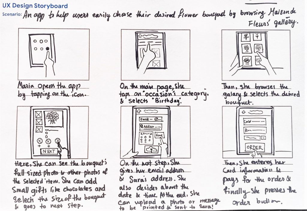
Close-up storyboard
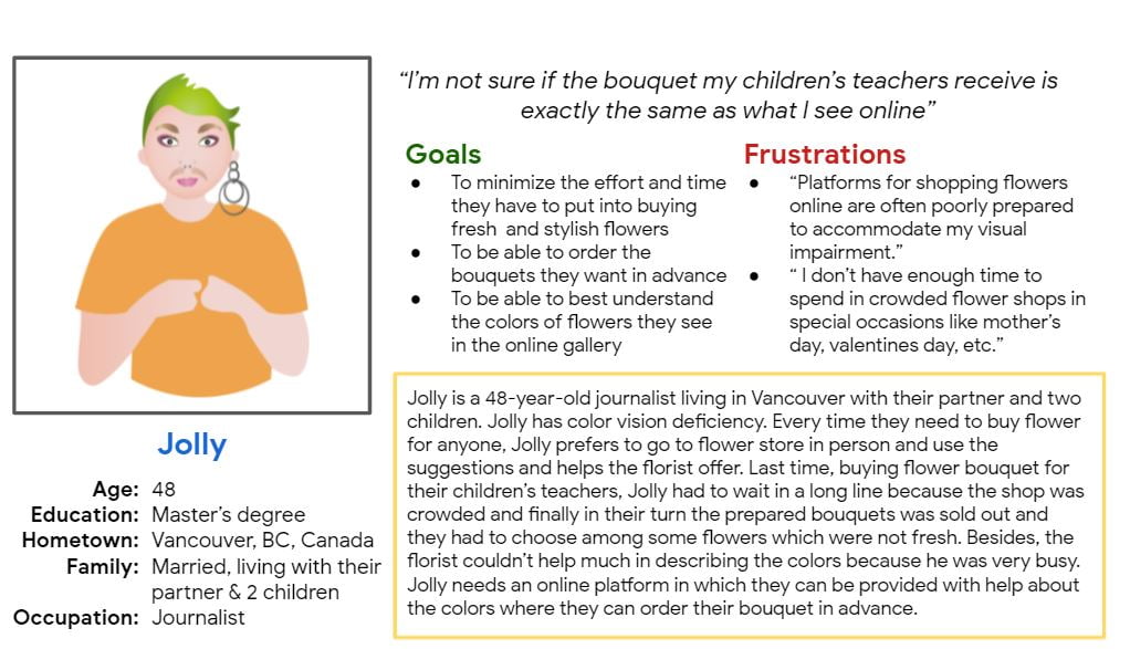
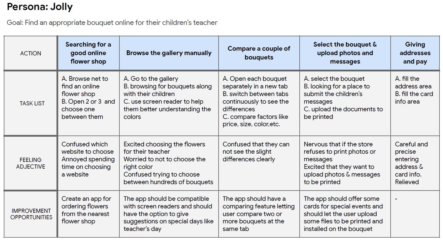
Persona: Jolly
Problem statement:
Jolly is a 48-year-old journalist living with their partner in Vancouver. They need an online flower shop helping them choosing the right bouquet for their children’s teachers in advance. Jolly has a color vision deficiency.
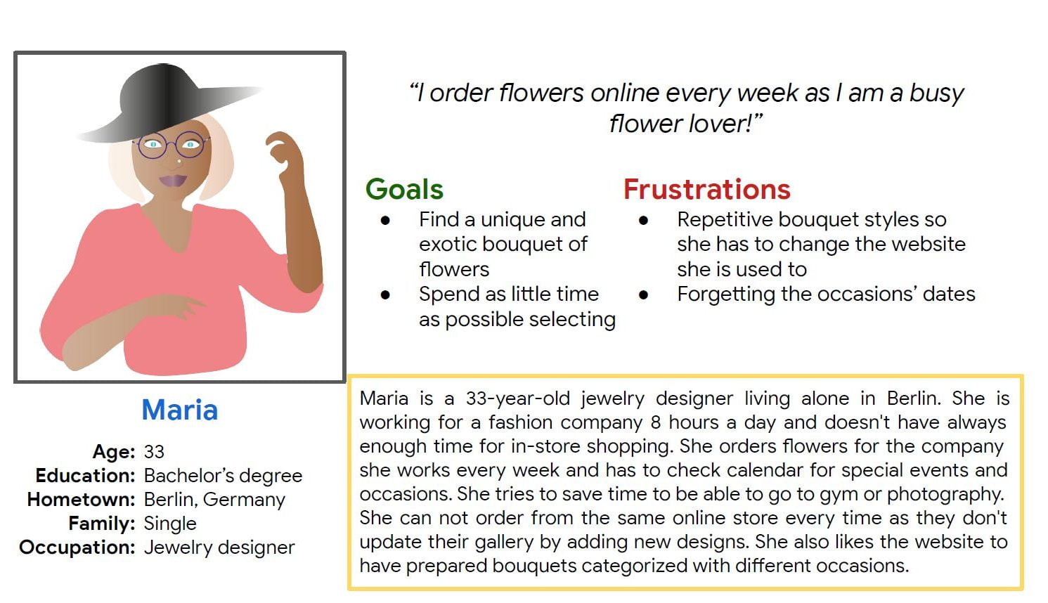
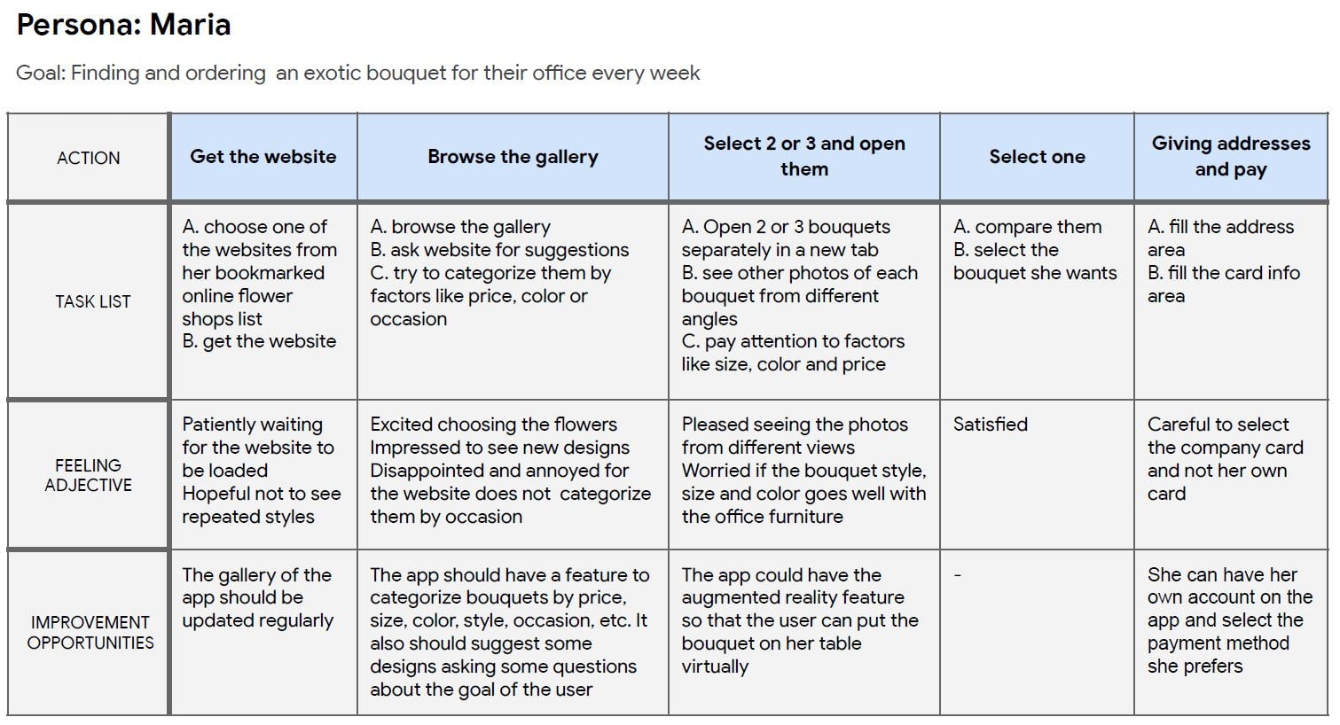
Persona: Maria
Problem statement:
Maria is a 33-year-old jewelry designer living by herself in Berlin.
She needs a website quickly helping her choosing an exotic bouquet by giving her suggestions because she is a busy person and she has to buy bouquets for her company weekly.
User journey map
Mapping the user journeys, revealed how helpful it would be for users to have access to a platform help them choosing their favorite flower bouquet.
Paper wireframes
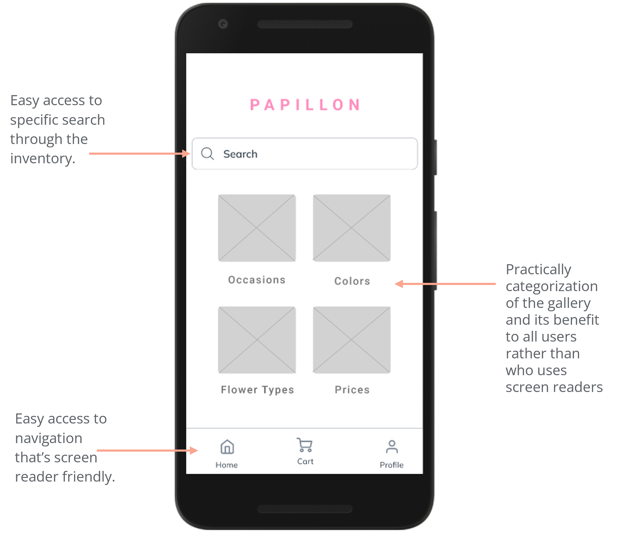
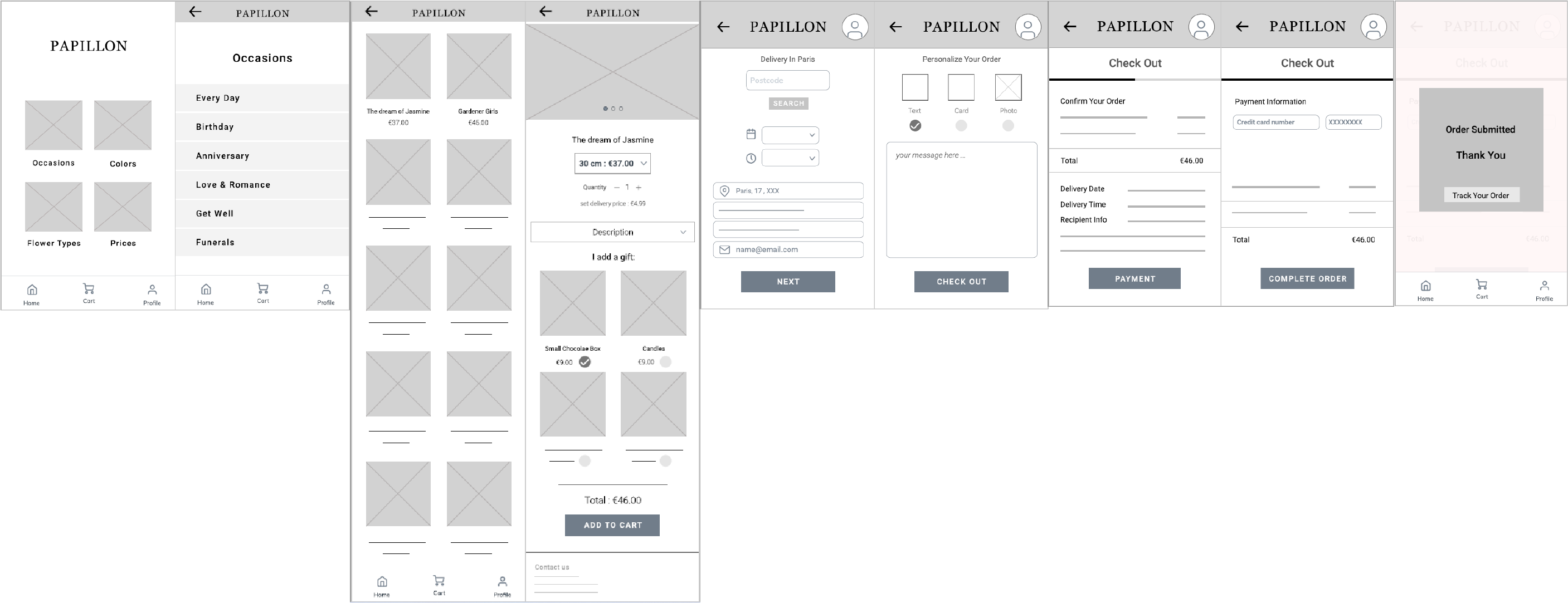
Taking the time to draft iterations of each screen of the app on paper ensured that the elements that made it to digital wireframes would be well-suited to address user pain points. For the home screen, I designed a quick and easy categorization tiles to help users easily determine.

Digital wireframes
The aim was to create an engaging, yet organized home page where users can find the bouquet they want easily.
I used Figma for creating my wireframes and prototypes.
Easy navigation was a key user need to address in the designs in addition to equipping the app to work with assistive technologies.
The home page includes three parts:
- Top: Search box
- Middle: Four categories of searching for a bouquet
- Bottom: Navigation bar
As the initial design phase continued, I made sure to base screen designs on feedback and findings from the user research.
The main use of the app is browsing and purchasing the flower bouquets.
Low-fidelity prototype
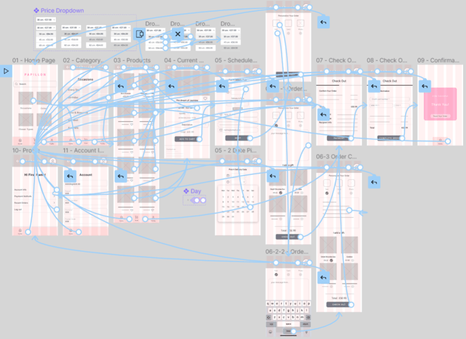
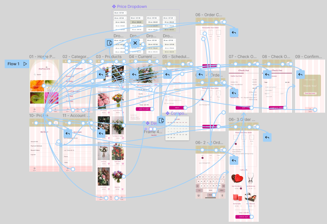
To prepare for the usability testing, I created a low-fidelity prototype using the completed set of digital wireframes. The primary user flow I connected was selecting a category, previewing the gallery and ordering a flower bouquet, so the prototype could be used in a usability study.
View the Papillon’s
low-fidelity prototype- Papillon
Usability Testing
The goal of usability testing was to figure out if users find the two core flows — browsing the flowers gallery, and purchasing the bouquets — in the app easy to use and suitable for their needs.
- Are there any parts of flow in the gallery or check out process that users get stuck in?
- Are users able to place their order?
- How do users feel about the purchasing process?
Methodology
Moderated Usability Study, conducted remotely with a UX designer supervising
Time and Place
● January 31 , and February 1● Paris and Montreal, remote
Length:
Each session will last 8 to 10 minutes, based on a list of prompts
Participants
5 participants: two male, two female, one non-binary all aged 22-65 years old. One participant is a person with a visual impairment.
Analyze and synthesize research results
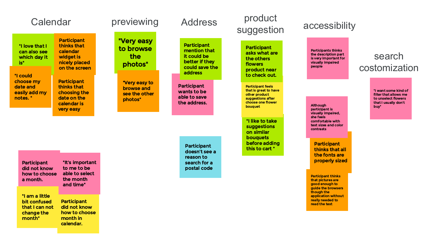
I gathered all the data and created affinity diagrams which helped me to discover the patterns and create insights and priorities based on urgency.
Usability study: findings
I conducted two rounds of usability studies. Findings from the first study helped guide the designs from wireframes to mockups. The second study used a high-fidelity prototype and revealed what aspects of the mockups needed refining.
1: Users want access to homepage from all the pages.
2: Users need more description on scheduling a delivery.
3: Users want to save their favorite bouquets.
1: Users need a way to select the month they want in the calendar.
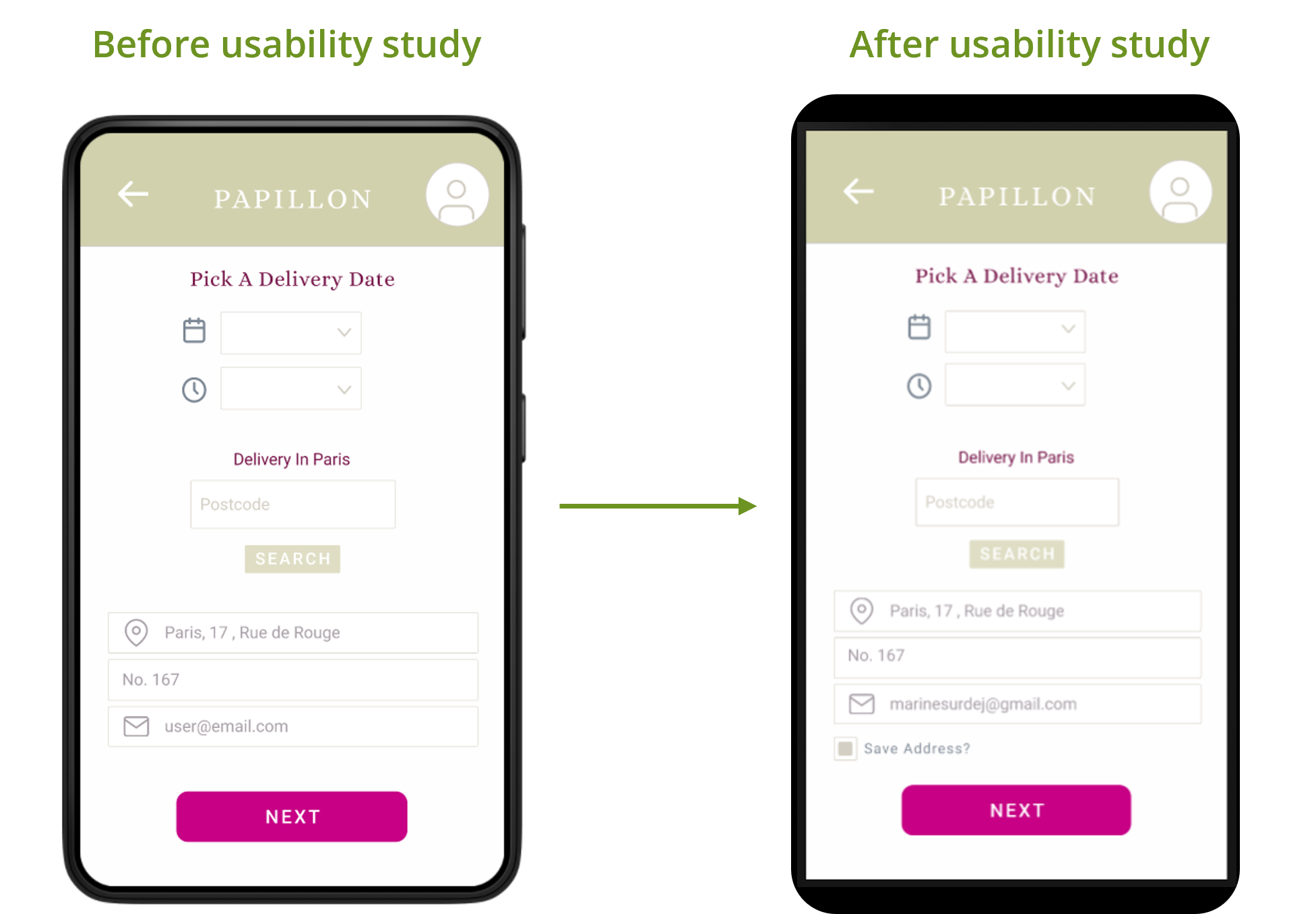
2: Users need a way to save the recipient’s entered address
Mockups
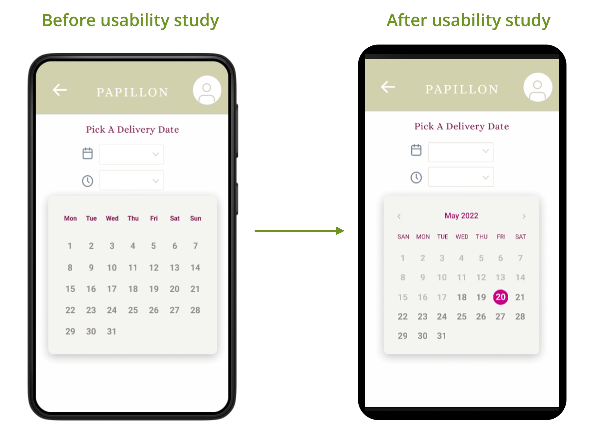
The second usability study revealed frustration with picking the delivery date in the calendar. To streamline this flow, I added a “month selector” to the calendar. I also demonstrated the unavailable dates in a more distinct way.
From the second usability study, I figured out that participants tend to save their recipient’s addresses for more convenience, so they can be able to find them easier in the future. Therefore, I added a checkbox under the address input which helps them save the entered address.
High-Fidelity Prototype
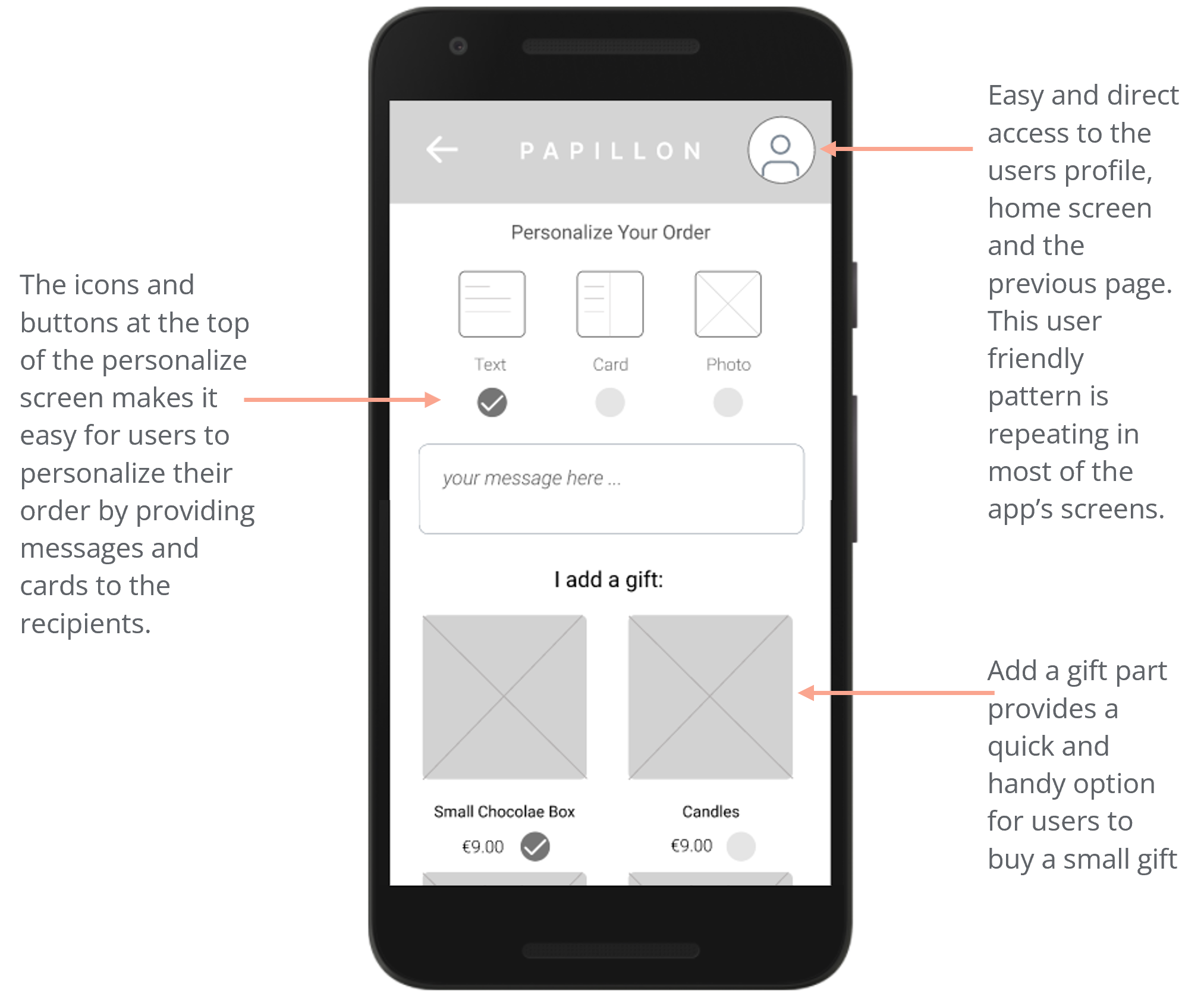
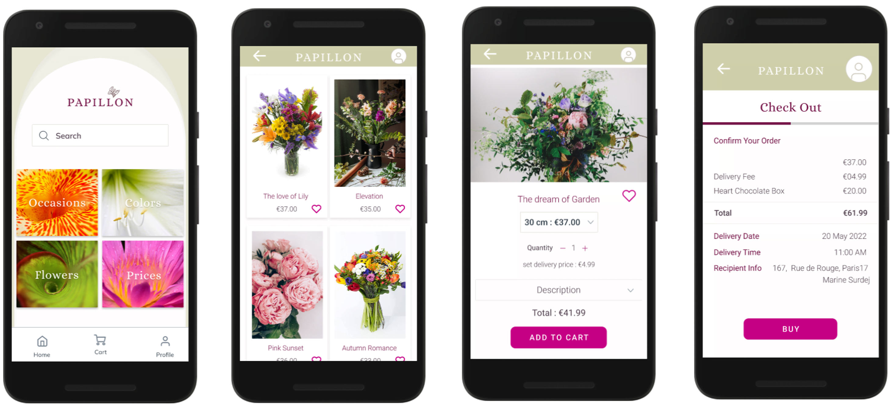
The final high-fidelity prototype presented cleaner user flow for previewing the flower bouquets and ordering them. It also met user needs for personalize their order by adding a message and a small gift.
View the Papillon app:
Accessibility considerations
1.
Provided access
to users who are vision impaired through adding alt text to images for screen readers.
2.
Provided a detailed description for each bouquet in which it describes the flowers and their colors in the bouquet for the
users with color vision deficiency.
3.
Used icons to
help make
navigation easier.
Takeaways
01.
Impact:
The app makes users feel like Papillon really thinks about how to meet their needs.
One quote from peer feedback:
“The app made it so easy and enjoyable to build order flowers! I would definitely use this app as a go-to for a gorgeous, quick flower bouquet ordering.”
02.
What I learned:
While designing the Papillon app, I learned that the first ideas for the app are only the beginning of the process. Usability studies and peer feedback influenced each iteration of the app’s designs.
Next steps
1.
Conduct another round of usability studies to validate whether the pain points users experienced have been effectively addressed.
2.
Conduct more user research to determine any new areas of need.
