UI/UX Case Study
Designing the Educational Journey Experience for
CosmoSavvy
A Cosmological Educational App
Project Overview
The CosmoSavvy case study was part of a student challenge aimed at honing our UX and UI skills under the guidance of a mentor.
The course objective was to either enhance the UI of an app we frequently use or to design a new product from scratch.
As a passionate space enthusiast who has tested nearly all existing space apps and avidly follows the latest cosmology theories on YouTube, I decided to design an educational app specifically tailored for the 12-24 age group.
My primary aim was to create an engaging educational platform that effectively delivers dense content in a way that resonates with CosmoSavvy users, aligning with their needs and expectations.
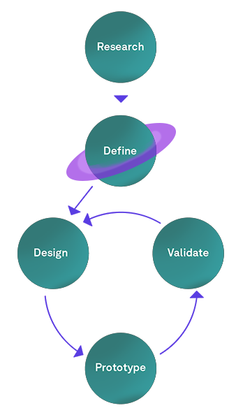
CosmoSavvy Objectives
1- Increase subscriptions among users aged 12-24.
2- Enhance educational content engagement and completion rates for subscribed users.
Problem Statement
While there is a growing interest in space exploration among younger audiences, many educational apps focus heavily on visually appealing interfaces but lack the depth of content necessary to sustain interest and promote learning in the 12-24 age group, leading to a gap between user engagement and educational value.
Expected Outcome
The expected outcome for CosmoSavvy is to significantly increase user engagement and retention by providing a visually captivating and content-rich educational experience tailored to the 12-24 age group. This approach aims to make complex cosmology concepts more accessible and enjoyable, fostering sustained interest and learning.
User research summary
To better understand the needs and pain points of the target audience for CosmoSavvy, I conducted a mix of user interviews and secondary research. I aimed to uncover frustrations and gaps in existing space education platforms, particularly focusing on online learning experiences. The research involved: Interviews with 2 students currently enrolled in a space education course, and analysis of course forums examining ongoing discussions related to online space learning. Interviews with 2 space education enthusiasts to gain insights from a passionate, non-student perspective, and review of user feedback on existing space-related apps.
Key Findings
1
Lack of Engagement in Online Courses
Opportunity: CosmoSavvy could solve this by introducing interactive features, such as zoomable 3D models of space objects, simulations of celestial events, and quizzes to test their knowledge.
2
Overwhelming Information Density
Opportunity: By incorporating a step-by-step educational approach, CosmoSavvy can provide a structured learning path, making it easier for users to follow along at their own pace.
3
Lack of Engagement in Online Courses
Opportunity: CosmoSavvy could include a curated glossary and reference section with trusted, up-to-date information about space topics.
4
Lack of Engagement in Online Courses
Opportunity: CosmoSavvy can stand out by offering both educational depth and visual appeal, providing an immersive experience that balances learning with exploration.
5
Lack of Engagement in Online Courses
Opportunity: CosmoSavvy can incorporate quizzes at the end of each educational module, allowing users to test their knowledge and reinforce learning through interactive challenges.
Key Insights
The research highlighted the need for a more interactive, structured, and engaging learning experience in the field of space education. Users wanted an app that combined fun, visual exploration with deep educational content, while also providing opportunities to test and apply their knowledge through quizzes and challenges.
Define
Persona Definition
Based on the insights from our research, two key archetypes emerged: the curious high school student, who craves engaging, interactive content to stay focused, and the passionate young adult, eager for deeper exploration but preferring a balance between education and discovery.
These personas guide the design of CosmoSavvy, ensuring it caters to both beginner and advanced learners with a structured yet immersive experience.
Curious Max, 16
The Telescope Dreamer

Background
Max is a high school student who’s curious about everything in the universe. He loves space documentaries and frequently daydreams about owning a telescope to stargaze. However, Max struggles with staying focused on long, text-heavy lessons in school and prefers learning through interactive activities or bite-sized videos. While Max is passionate about space, he tends to lose interest when the content becomes too dense or theoretical.


Goals

Frustrations

Needs
1- To explore space in an exciting and hands-on way.
2- To dive deeper into space topics by learning at his own pace.
3- To start a stargazing hobby.
1- Struggles with concentration on long, dense content.
2- Finds many space-related apps too technical or passive.
1- Engaging, visual, and interactive learning tools, like 3D models.
2- Short, digestible lessons that keep his curiosity alive.
3- Fun quizzes and games.
Passionate Luna, 21
The Aspiring Astronomer


Background
Luna is a university student studying physics with a passion for space. She is always the first to jump in when helping others understand complex concepts. However, despite her love for space, Luna can get impatient with overly wordy or repetitive material. She prefers interactive learning, where she can explore celestial bodies and theories in more depth. Luna loves reading about space but is looking for ways to make learning more exciting and less monotonous.

Goals

Frustrations

Needs
1- To deepen her understanding of space through hands-on exploration.
2- To help others by sharing her knowledge.
3- To find a tool that makes space education both informative and exciting, without the fluff.
1- Gets impatient with long, repetitive texts.
2- Struggles to find apps that balance education and exploration.
3- Disappointed by many space apps focusing too much on visuals without deeper educational content.
1- A well-structured, interactive learning path.
2- Trusted, up-to-date space resources.
3- Visual exploration tools, such as zoomable 3D models of galaxies and planets.
Solution Ideation
Competitive Analysis
Before starting the Ideation phase, I analyzed existing space education apps to identify gaps and opportunities. This competitive analysis helped shape the direction for CosmoSavvy, ensuring it offers a more engaging, educational, and interactive experience than current solutions.
Criteria
Educational Depth
Basic, focuses mainly on stargazing without structured lessons.
Offers more detailed information than Sky View, but no structured learning path.
Detailed, advanced information but no beginner-friendly content or structured learning.
Basic, focused on visual identification of celestial bodies with limited educational content.
Offers moderate depth with detailed information on planets but no structured lessons.
Interactivity & Engagement
Interactive AR stargazing but lacks quizzes or active engagement.
Interactive stargazing but no quizzes or gamification.
Technical, suited for advanced users but lacks engagement tools like quizzes.
AR-based stargazing but lacks engagement features like mini games or quizzes.
Features 3D models but lacks interactive learning tools like quizzes.
Visual Appeal
Attractive AR visuals, strong on visuals but minimal educational content.
Beautiful real-time celestial visualizations, though education takes a back seat.
Highly realistic night sky visuals, overwhelming for beginners.
Visually appealing AR, prioritizes visuals over deeper educational value.
Stunning 3D models, with more focus on visuals than educational content.
Accessibility for Beginners
Very beginner-friendly, with an intuitive interface.
Accessible and easy to use for beginners.
Not beginner-friendly; suited for users with astronomy knowledge.
Beginner-friendly, easy to navigate.
Beginner-friendly, but educational content remains basic.
Customization & Personalization
Minimal customization, standard experience for all users.
Limited, with no personalized learning options.
Strong customization options but no personalized learning path.
Limited, no tailored learning experience.
Minimal customization; mostly a passive exploration tool.
Real-World Connection
Strong link to real-time stargazing but lacks broader space context.
Strong connection to real-time celestial events but mainly for observation.
Excellent real-time celestial event tracking with accurate data.
Strong for real-world stargazing but limited beyond that.
More focused on solar system exploration, less on real-time celestial events.
HMW Statements
In order to reframe the pain points into actionable opportunities, I formulated key How Might We (HMW) questions to explore creative solutions that address the core pain points of our personas and guide the ideation process for CosmoSavvy.
1- Engaging Younger Learners
Situation
High school students like Max struggle to stay focused on long, text-heavy space lessons.
Issue
Current space education tools don’t offer enough interactivity or bite-sized learning content.
HMW
How might we make space education more engaging by breaking down content into interactive, digestible parts?
2- Simplifying Complex Theories
Situation
Space theories are often too complex for beginner learners, causing confusion.
Issue
Learners need a simpler way to understand and engage with difficult space concepts.
HMW
How might we simplify complex space theories without losing their educational value?
3- Fostering Interactive Exploration
Situation
Passionate learners like Luna crave deeper engagement with space content but often find existing tools too shallow or visually focused.
Issue
Most space apps lack depth and only offer surface-level exploration of celestial bodies.
HMW
How might we provide interactive tools that offer both visual appeal and deeper educational content?
4- Maintaining Attention with Short Lessons
Situation
Students often lose focus when presented with long lessons or passive videos.
Issue
Long content leads to decreased attention and learning retention.
HMW
How might we design shorter, more focused lessons that maintain user attention and boost retention?
5- Encouraging Hobbies in Space Exploration
Situation
Curious learners are interested in space as a potential hobby, such as stargazing or telescope buying.
Issue
There’s little guidance or inspiration for turning curiosity into a tangible hobby.
HMW
How might we inspire users to explore space as a hobby, encouraging activities like stargazing?
6- Enhancing Learning Through Quizzes
Situation
Many users want to test their knowledge but find few opportunities for interactive challenges.
Issue
Existing apps don’t offer enough quizzes or gamified learning to reinforce space knowledge.
HMW
How might we integrate fun, interactive quizzes to help users retain space concepts?
Impact-Effort Matrix
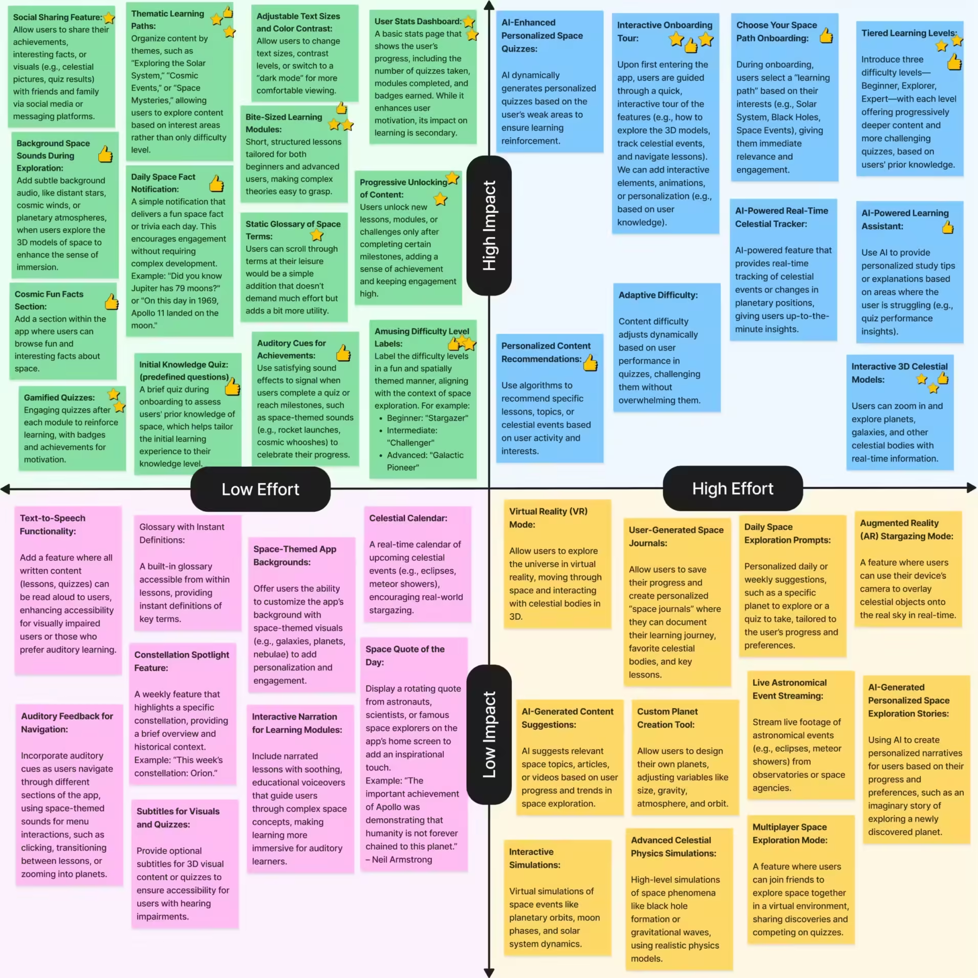
After brainstorming and mind mapping around the HMW questions, I generated a wide range of ideas to enhance CosmoSavvy. I then used an Impact-Effort Matrix to prioritize these ideas, focusing on those that deliver the greatest value with the least effort.
Design
Wireframing
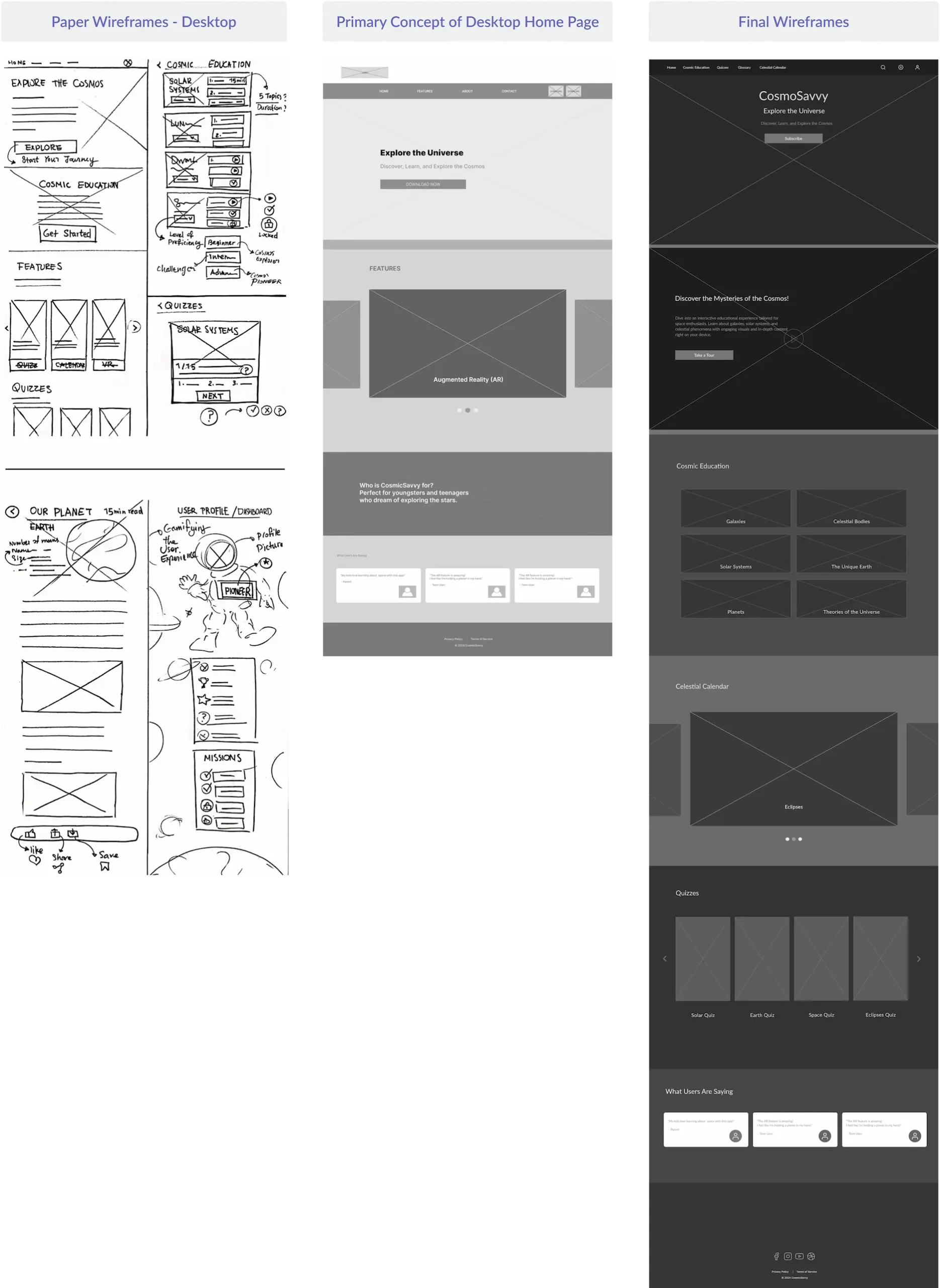
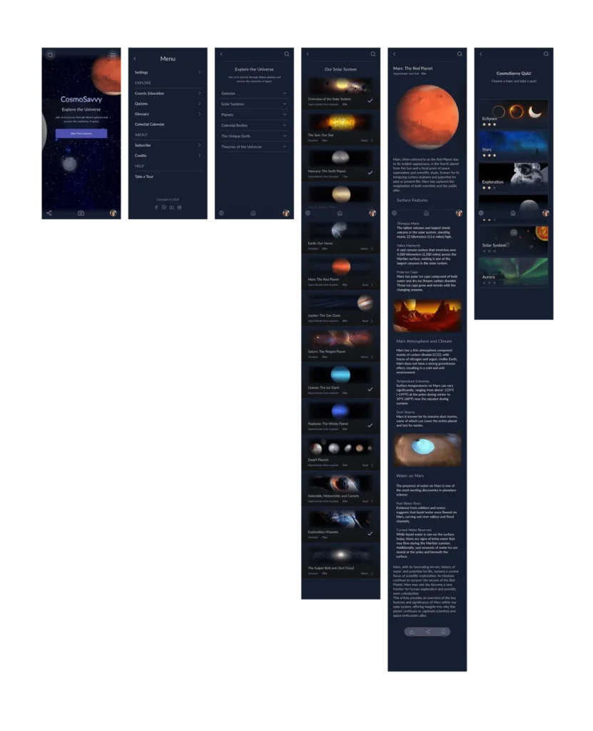
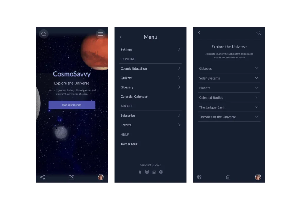
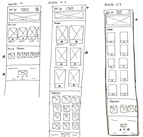
I started by sketching wireframes on paper for the mobile version, generating various ideas. I then moved to Figma, where I created low-fidelity digital wireframes, initially designed as a single-page application (SPA). After further iterations, I refined the design into its final form. I eventually decided to shift away from the SPA model, focusing instead on a more interactive mobile experience, with the landing page dedicated to exploring space. Below, you can see how the wireframes evolved over time!
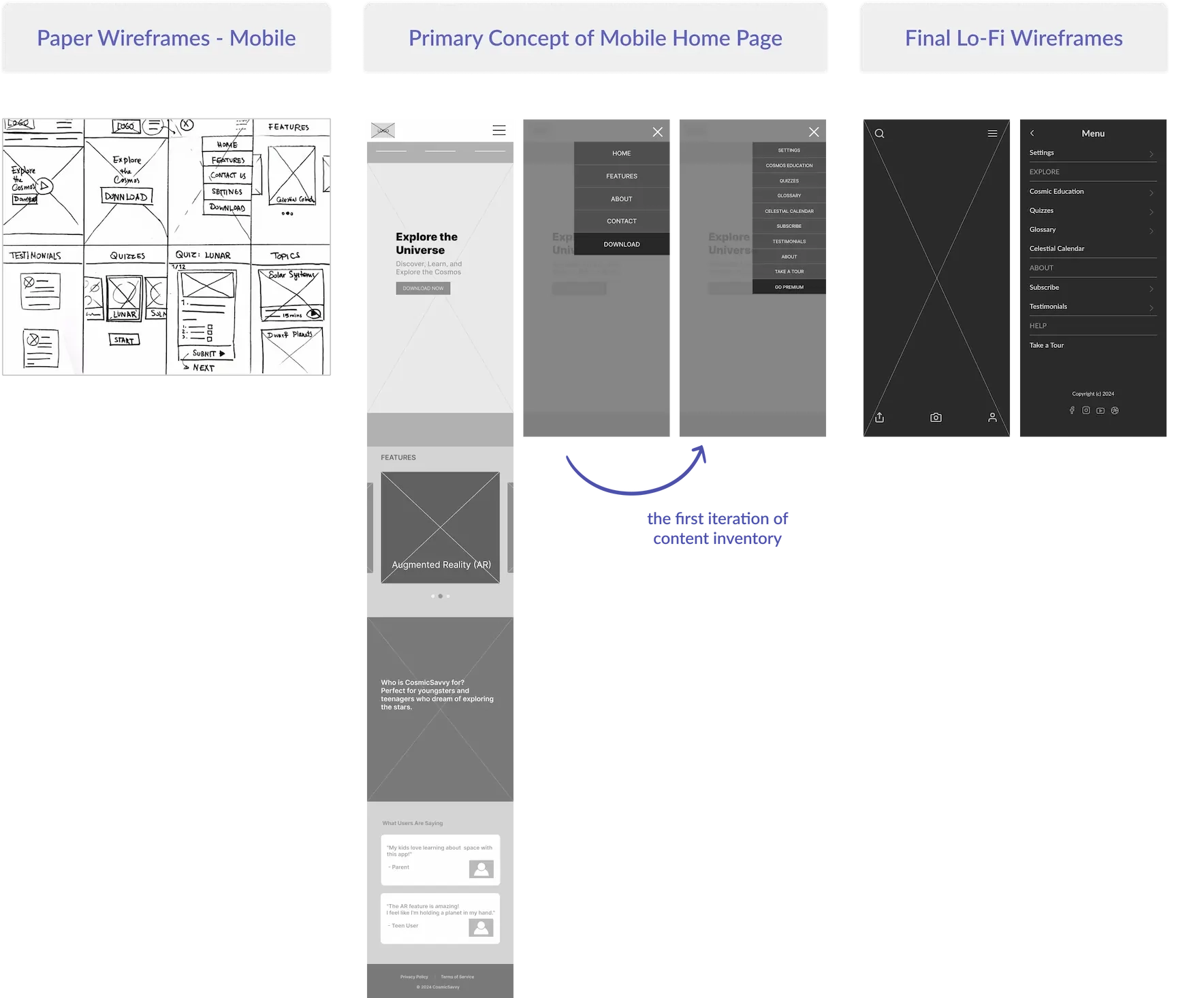
Moving on to desktop wireframing, I considered that this product is primarily used on mobile devices and tablets, where the user experience differs significantly from that of the web app. To ensure a seamless experience across all platforms, I needed to adjust certain elements of the web app while maintaining consistency and ease of use.
Information Architecture
Content Inventory: Explore
This category features Cosmic Education, the app's core section, containing most of the educational content. Each subtopic includes articles, interactive models, simulations, and optional quizzes. To ensure a seamless user experience, I structured the app's IA around four main sections: Cosmic Education, Quizzes, Glossary, and Celestial Calendar. These sections are carefully organized to guide users intuitively through the content.
Cosmic Education
• Galaxies
• Solar Systems
• Planets
• Celestial Bodies
• The Unique Earth
• Theories of the Universe
Cosmic Education
Short quizzes to test knowledge on each topic.
Glossary
Definitions and Search Functionality for key terms.
Celestial Calendar
Upcoming celestial events such as eclipses, meteor showers, and auroras.
In addition to these core sections, I included Settings, About (Subscribe and Testimonials), Help (Take a Tour), and social media links in the mobile app's navigation menu. For the desktop version, these features are integrated into the navigation bar. Key functionalities such as the user and search icons are accessible on the mobile landing page, while Settings is seamlessly incorporated into the mobile app's navigation menu.
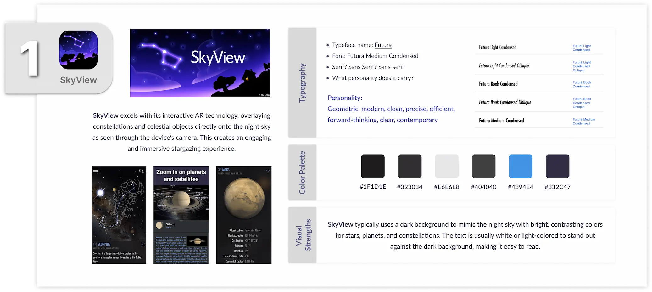
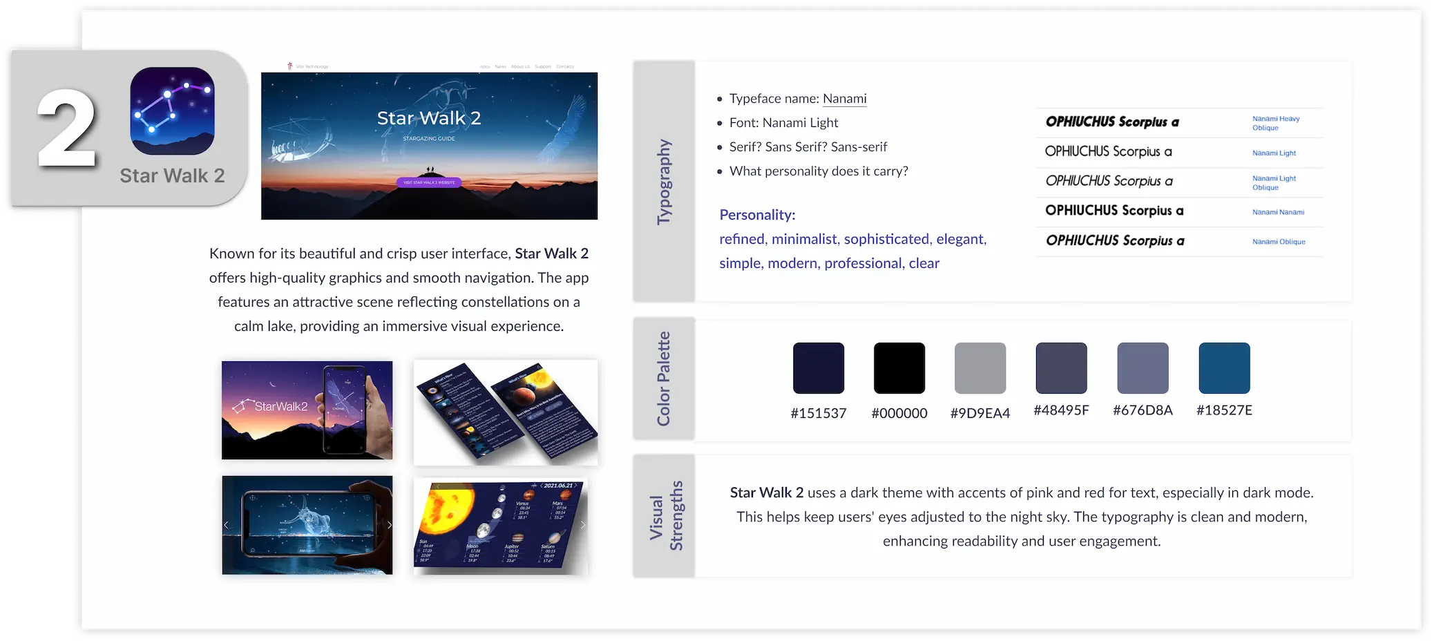
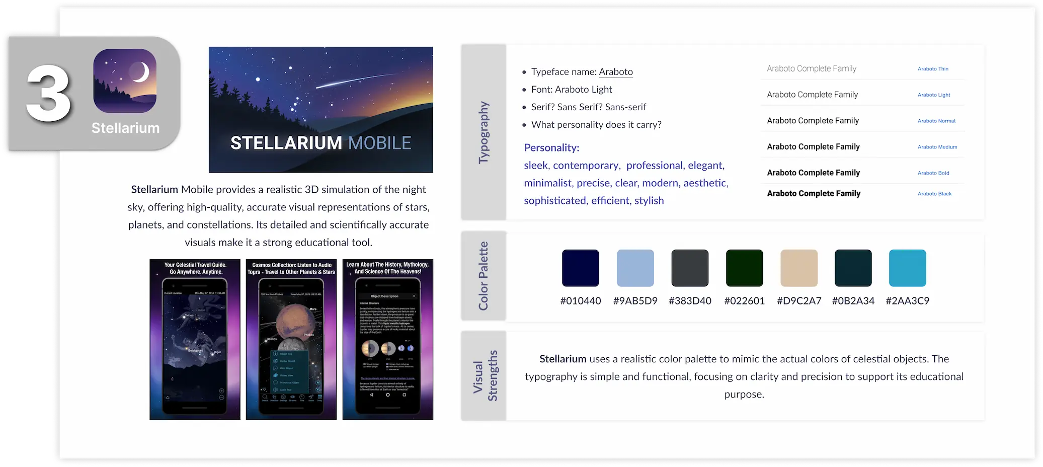
Competitor UI Analysis
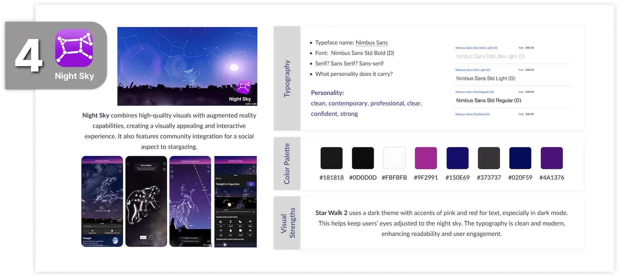
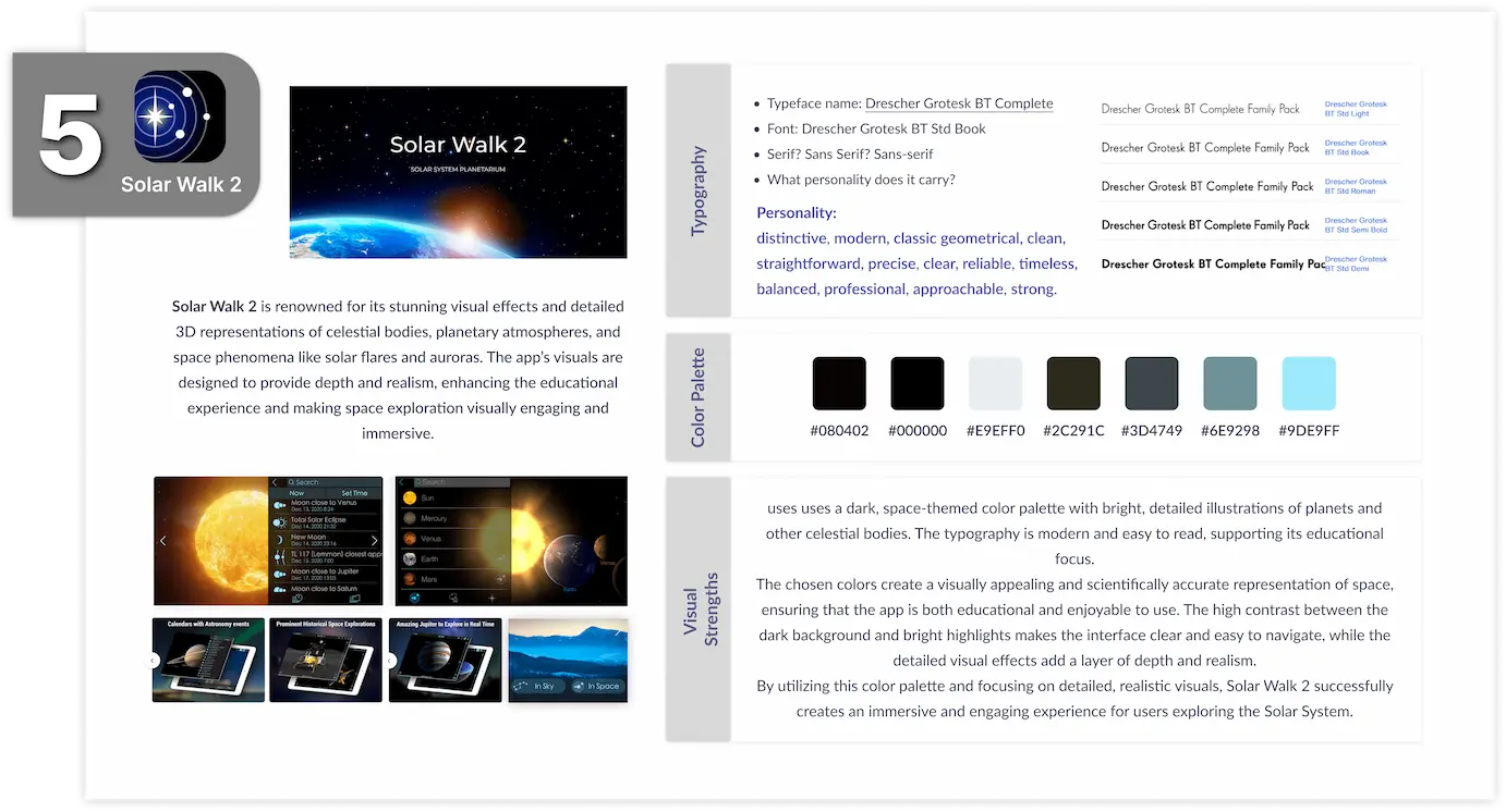
Before moving into the UI design phase, I conducted a comprehensive interface analysis of our five competitor apps. This analysis helped identify common trends and areas for improvement, guiding the design decisions for CosmoSavvy to stand out with a more engaging and user-friendly interface.
CosmoSavvy UI Kit
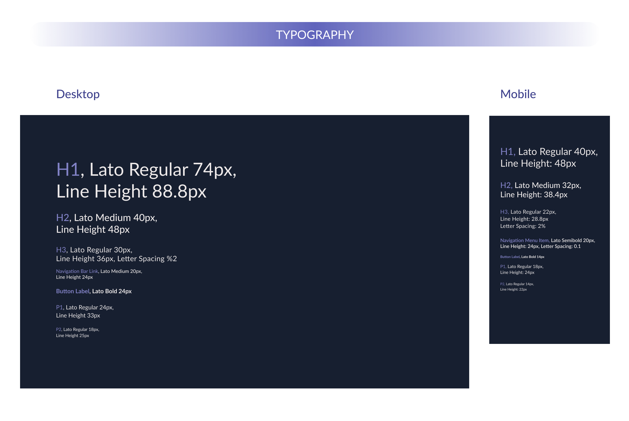
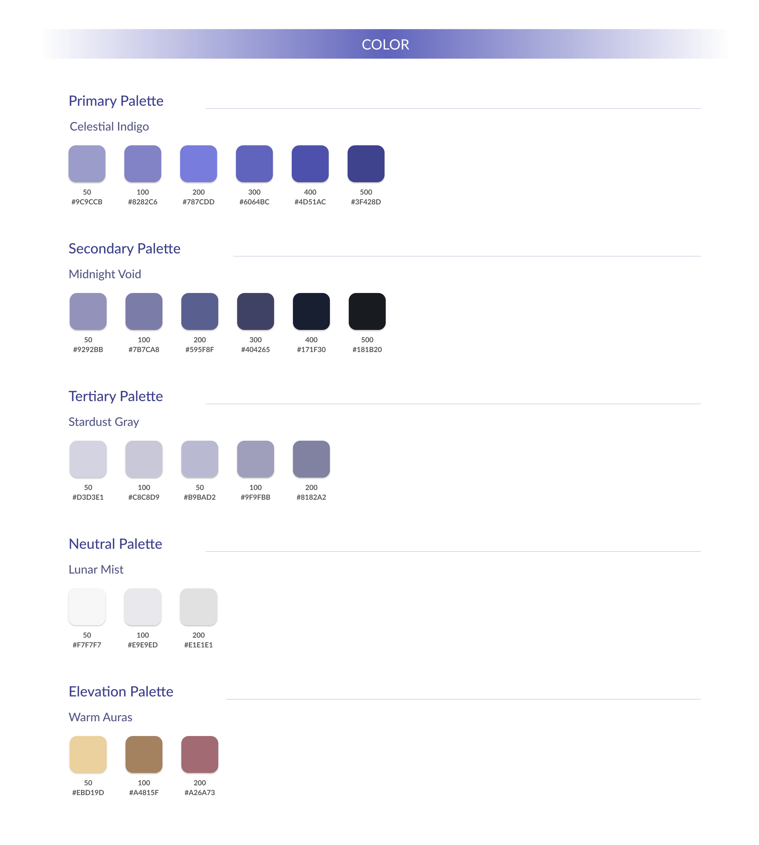
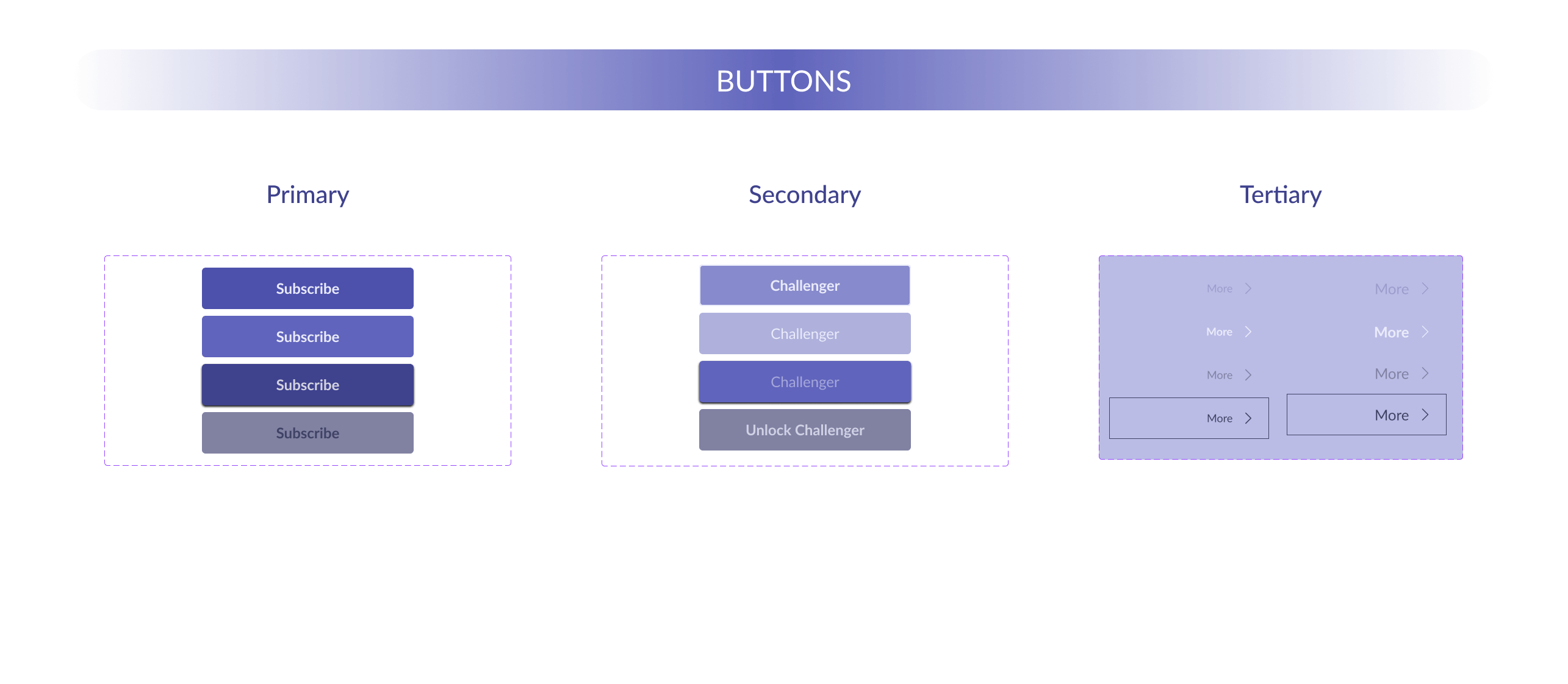
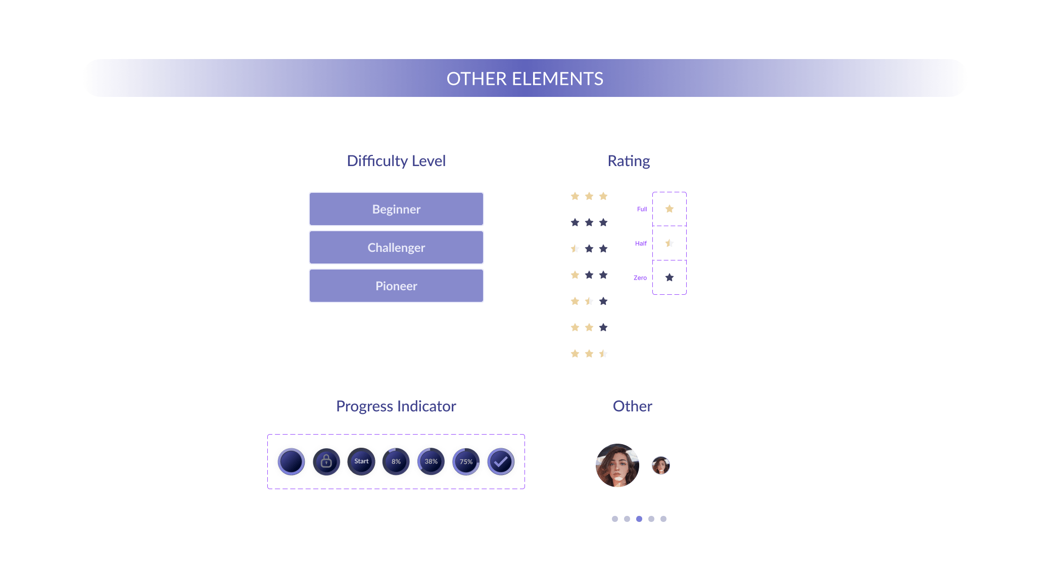
Following the competitor analysis, I developed a comprehensive UI kit to establish a cohesive visual language for CosmoSavvy. This kit includes typography, color palettes, buttons, and other key components that ensure consistency across the app.
High Fidelity wireframes
<span data-metadata=""><span data-buffer="">Developing Content Inventory for CosmoSavvy
After analyzing competitors and considering my product's goals, I developed a content inventory for my app. I defined several categories and subcategories, which I will implement in more detail in my design later. The inventory is listed below:
1. Explore
This category includes Cosmic Education which is the main section of the app. It contains the most of the educational stuff. Each subtopic will have articles, interactive models, simulations, and optional quizzes.
Topics and Subtopics:
Cosmic Education
Galaxies: Creation of Existence, Types, Milky Way, and neighboring galaxies.
Mobile Hi-Fi wireframes
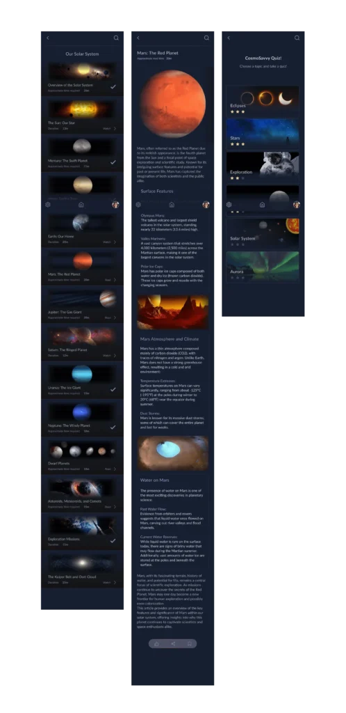
Desktop Hi-Fi wireframes
Paper wireframe screen size variations
Because BookMySeat’s users access the site on a variety of different devices, I started to work on designs for additional screen sizes to make sure the site would be fully responsive.
Validation
In these sessions, participants were asked to complete various tasks within CosmoSavvy, while their navigation choices, mental models, and engagement patterns were observed. By iteratively gathering feedback, I was able to identify subtle areas where clarity and motivation could be improved, without compromising the app's functionality. This allowed implementing refinements—such as consistent color-coding, progress indicators, and improved readability—that decreased cognitive load and made navigation and content engagement more seamless. Based on these insights, I introduced targeted changes to elevate the overall user experience.
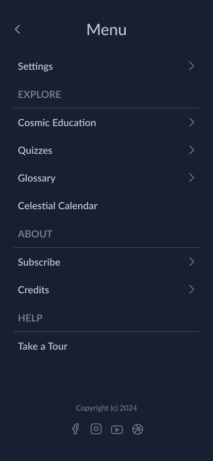
Iterations: Mobile Version - Navigation Menu
Pre-Iteration Version
Post-Iteration Version
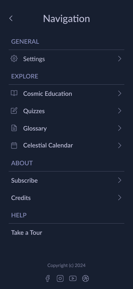
1. Header Title Changed from "Menu" to "Navigation" to better represent the drawer’s purpose, making it clear that this is the main navigation area.
2. "Settings" was moved under a new "General" header for clearer categorization. This new section organization improves accessibility, making it easier for users to locate specific settings.
3. Visual Hierarchy: Headers (General, Explore, About, Help) now appear with slightly lighter text, providing clearer separation between sections.
4. Icons were added next to items under "Explore" to provide visual cues, enhancing usability and making it faster for users to identify sections at a glance.
Iterations: Mobile Version - Cosmic Education
Pre-Iteration Version
Post-Iteration Version
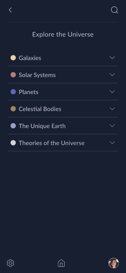
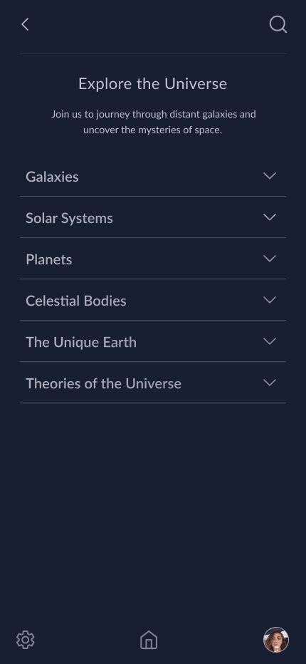
Removed the introductory line: "Join us to journey through distant galaxies and uncover the mysteries of space." to create a cleaner, more minimal look, allowing users to focus directly on the main content categories.
2. Color-Coded Subject Indicators:
Before Iteration all subjects had the same visual treatment, which didn’t visually distinguish categories. Unique color-coded dots were added next to each subject (e.g., pale gold for Galaxies, pale rose for Solar Systems), enhancing visual hierarchy and helping users intuitively recognize and navigate each subject.
Iterations: Mobile Version - Cosmic Education: Explore Topics
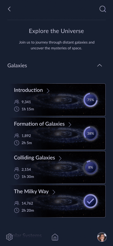
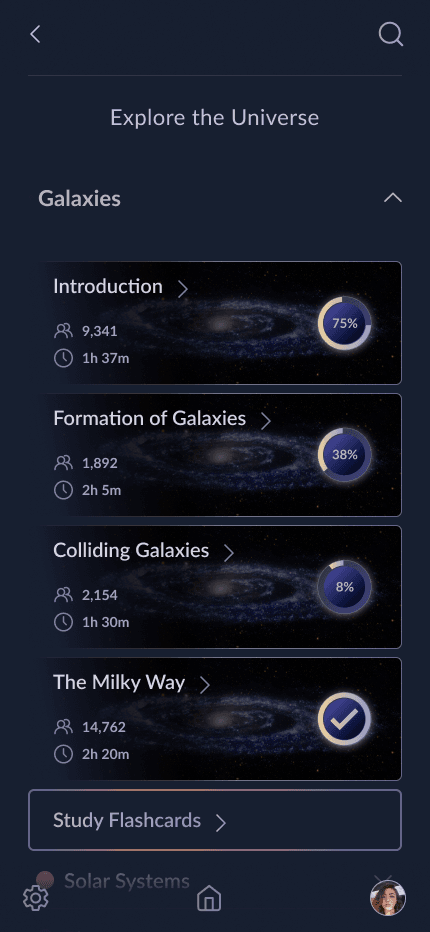
Removed this introductory line, "Join us to journey through distant galaxies and uncover the mysteries of space." to reduce visual clutter, placing immediate focus on the content and topics. This change helps users dive directly into the subject matter without distraction.
2. Color Coding for Visual Consistency:
The color-coded accents from the subject list view (e.g., pale gold for Galaxies) were applied consistently across topics, allowing users to recognize each category by color association. Completion indicators were also refined to align with the color theme, enhancing clarity in progress tracking and creating a visually cohesive design.
3. Addition of "Study Flashcards" CTA:
Added a "Study Flashcards" button at the bottom, giving users a convenient and clear call-to-action to review key terms or concepts related to the topic. This provides a more seamless learning path within each subject.
Pre-Iteration Version
Post-Iteration Version
Iterations: Desktop Version - Cosmic Education: Explore Topics
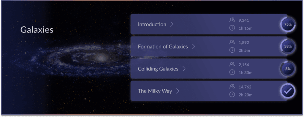
Pre-Iteration Version – Default State
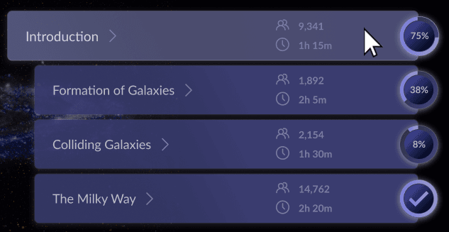
Pre-Iteration Version – Hover State
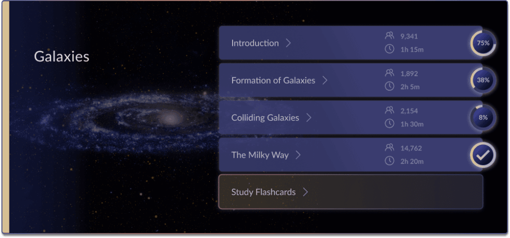
Post-Iteration Version – Default State
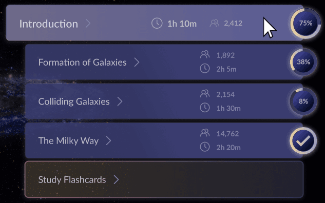
Post-Iteration Version – Hover State
1. Enhanced Visual Consistency with Color Coding
As with the mobile version, unique color-coded accents (e.g., pale gold for Galaxies, rose for Solar Systems) were added to each subject, enhancing visual distinction and category recognition.
2. Progress and Access Indicators
Introduced completion indicators and status icons (e.g., "Start," "Locked") for better progress tracking and accessibility across topics.3. Flashcard Access
Added a clear "Study Flashcards" button under each subject, making study tools more accessible.4. Hover State:
In this iteration, hovering over a subject subtly enlarges the title and the progress indicator, enhancing focus and making the interaction feel more dynamic. Additionally, the arrangement of information has been refined for clarity. A subtle background color change is also applied.
Iterations: Mobile Version - Our Solar System
Pre-Iteration Version
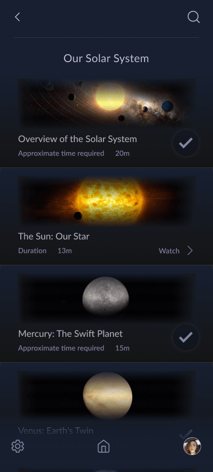
2. Completion Indicators for Enhanced Visual Consistency: Completion indicators have been refined and standardized to align with the color-coded theme, ensuring a cohesive look and reinforcing familiarity with category colors (e.g., pale rose for the Solar System).
Post-Iteration Version
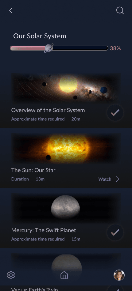
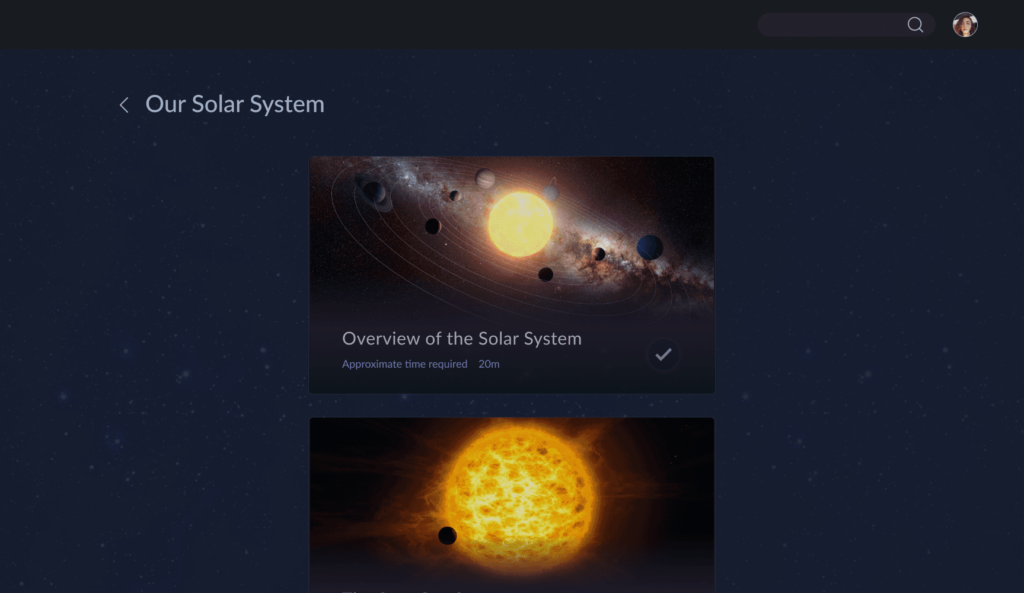
Iterations: Desktop Version - Cosmic Education: Explore Topics
Pre-Iteration Version
Post-Iteration Version
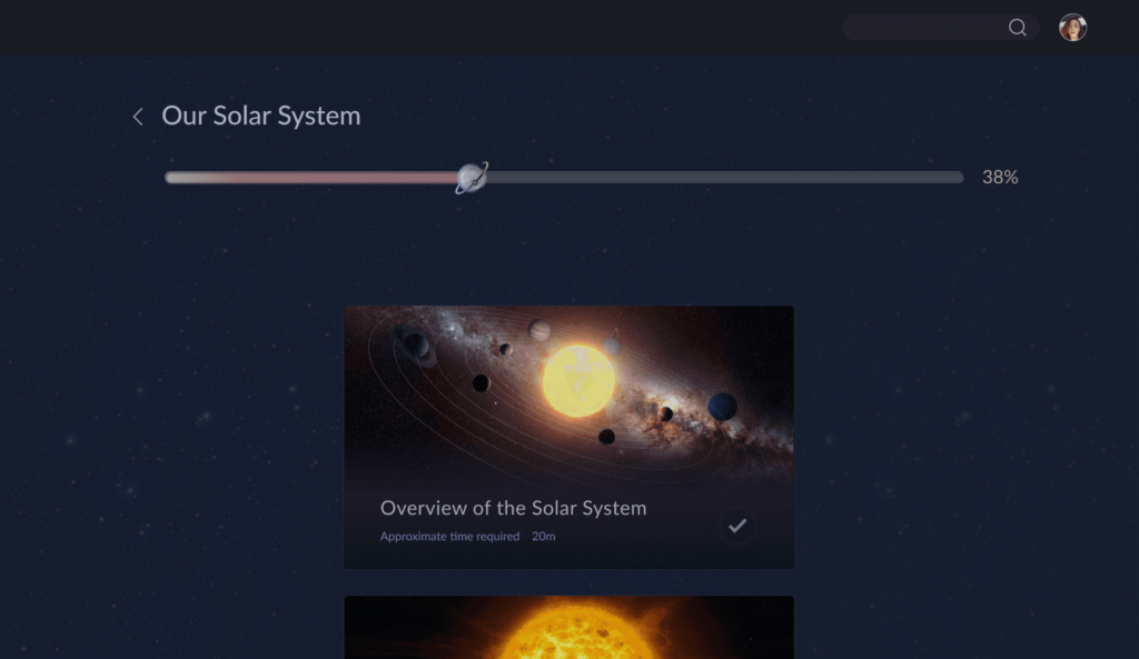
A progress bar was added at the top of the page, indicating overall completion for the "Our Solar System" topic.
The header and progress bar section visually highlight the current topic's importance, enhanced the visual hierarchy.
2. Hover Effects:
Updated hover states enlarge the card and shift visual focus to the hovered item, improving engagement and feedback.
3. Consistent Color Coding:
Color-coded accents were implemented for visual consistency, reflecting the mobile version's design language.
Prototype
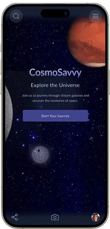
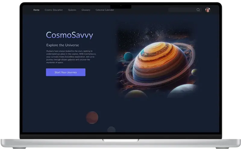
Explore the interactive prototypes of CosmoSavvy designed for mobile and desktop experiences. Click the respective links below to view the prototypes and navigate through the app's core features.
Mobile Prototype: View Mobile Version
- Path: Start from the Cosmic Education section under the Navigation Menu→ Our Solar System under Solar Systems → Explore planets like Mars, and then go back to Home.
Desktop Prototype: View Desktop Version
- Path: Begin with Cosmic Education on the main page → Solar Systems→ Our Solar System→ Mars
Mobile Prototype
Desktop Prototype
Challenges and Learnings
1. Establishing a Clear Information Architecture:
Structuring the app's diverse educational content into an intuitive and logical hierarchy was essential to enhance usability. The process involved organizing information into meaningful categories and ensuring that users could easily navigate through the app without feeling overwhelmed.
2. Designing for a Dark Background:
Creating a cohesive and accessible design on a dark background posed unique challenges, as it required careful attention to contrast and readability. Selecting a color palette that enhanced visual appeal while ensuring usability was a key focus throughout the design process.
3. Scope and Time Constraints:
This project was conceptual and limited to a 6-week timeline, which restricted the depth of research and the number of iterations that could be conducted. Balancing the design of both desktop and mobile versions within this timeframe required prioritizing core features and focusing on impactful refinements.
1. Design Adaptability and Innovation:
Working on a conceptual project required flexibility and creativity, particularly in designing an educational app with a dark theme. This process reinforced the importance of balancing aesthetics with usability, ensuring accessibility without compromising visual appeal.
2. Simplifying Complex Information:
Structuring detailed space education content into intuitive categories emphasized the significance of a well-planned information architecture. This helped me understand how to simplify complex topics for better user engagement and learning outcomes.
3. Time Management and Prioritization:
With a limited five-week timeline, I learned to prioritize key user needs and focus on impactful iterations. This experience taught me how to deliver meaningful results under strict time constraints while managing project scope effectively.
4. Iterative Problem-Solving:
Through multiple rounds of feedback, I refined designs to improve navigation, consistency, and clarity. This iterative process highlighted the importance of collaboration and user testing in achieving polished and user-friendly designs.
The CosmoSavvy project allowed me to explore and refine essential UX/UI design principles, emphasizing user engagement, accessibility, and aesthetic harmony. By focusing on structured content delivery and iterative problem-solving, the prototype provides a strong foundation for an interactive and educational app experience.
Next Steps
1. User Dashboard
Design a personalized dashboard for users to track progress, achievements, and upcoming celestial events.
2. Interactive Quizzes
Develop engaging, gamified quizzes to test knowledge retention and make learning fun.
3. Mini Games
Introduce space-themed mini-games to make learning even more enjoyable and appealing to younger audiences.
4. Celestial Calendar
Expand the celestial calendar with interactive visuals and notifications for astronomical events like eclipses and meteor showers.
Thank you for reviewing my work on the CosmoSavvy Case Study!
