Project overview
The product:
BookMySeat is a seat reservation website that offers the opportunity to search the movies by genre, theatre or time, and the users can finally book the seats.
Project duration:
March 2022 to May 2022
The problem:
Available online seat reservation websites have cluttered designs, inefficient system for comparing and browsing through movies, and confusing checkout process.
The goal:
Design the BookMySeat website to be user friendly by providing clear navigation and offering a fast checkout process.
My role:
UX Designer leading the BookMySeat website design
Responsibilities:
Conducting interviews, paper and digital wireframing, low and high fidelity prototyping, conducting usability studies, accounting for accessibility, iterating on designs and responsive design.
User research: summary
I conducted user interviews, which I then turned into empathy maps to better understand the target user and their needs. I discovered that many target users treat online seat reservation as a quick activity when they need to make sure that they have booked their seats before heading to theaters. However, many reservation websites are overwhelming and confusing to navigate, which frustrated many target users. This caused a normally enjoyable experience to become challenging for them, defeating the purpose of being quick and practical.
User research: pain points

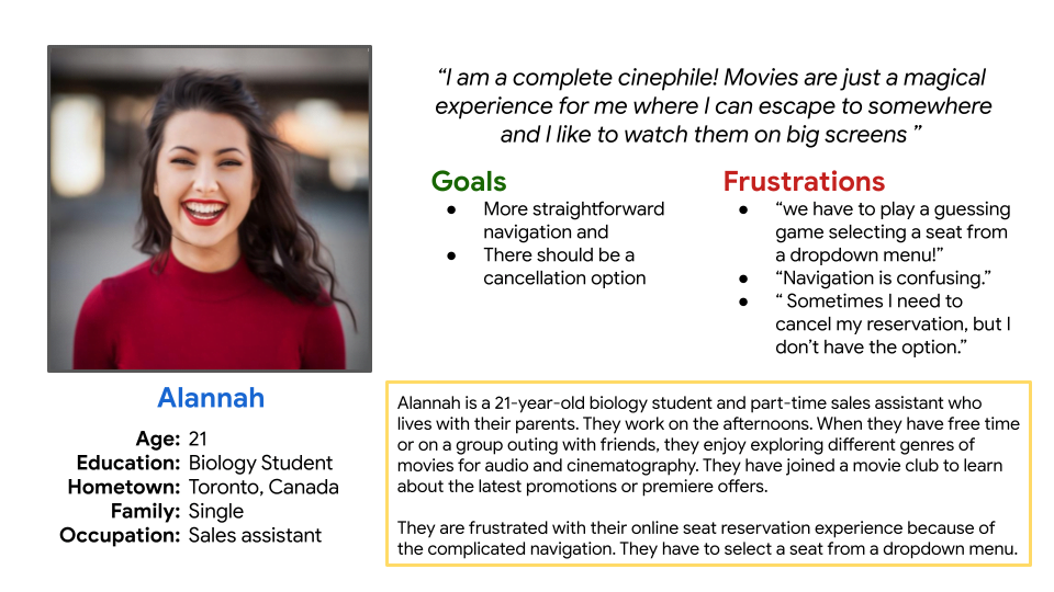
Persona: Alannah
Problem statement:
Alannah Is a busy university student who needs intuitive website navigation and search filters because they want online seats reservation and booking to be stress free.
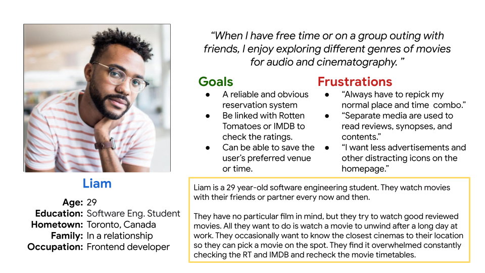
Persona: Liam
Problem statement:
Liam is a busy software engineer and student who likes to watch movies to unwind after a long day at work. They need the website to offer them the reviews on movies and the popularity rates.
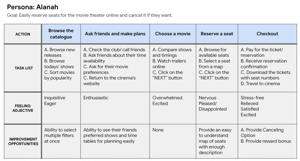
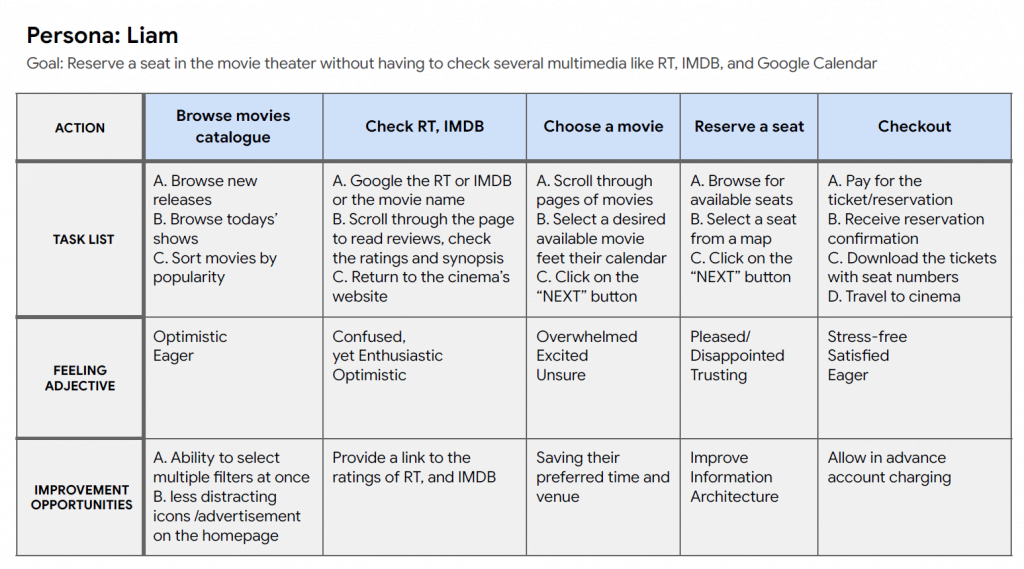
User journey map
I created a user journey map of Alannah’s experience using the site to help identify possible pain points and improvement opportunities.
Sitemap
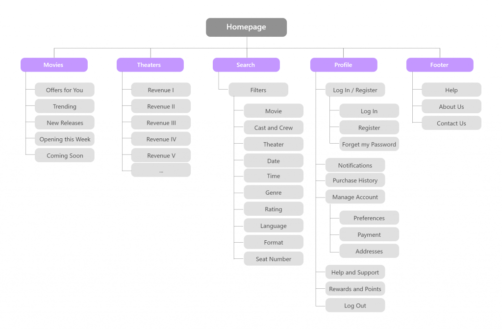
Difficulty with website navigation was a primary pain point for users, so I used that knowledge to create a sitemap. My goal here was to make strategic information architecture decisions that would improve overall website navigation. The structure I chose was designed to make things simple and easy.
Paper wireframes
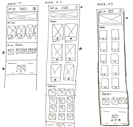
Next, I sketched out paper wireframes for each screen in my app, keeping the user pain points about navigation, browsing, and check out flow in mind. The home screen paper wireframe variations to the right focus on optimizing the browsing experience for users.
* Stars were used to mark the elements of each sketch that would be used in the initial digital wireframes.

Paper wireframe screen size variations
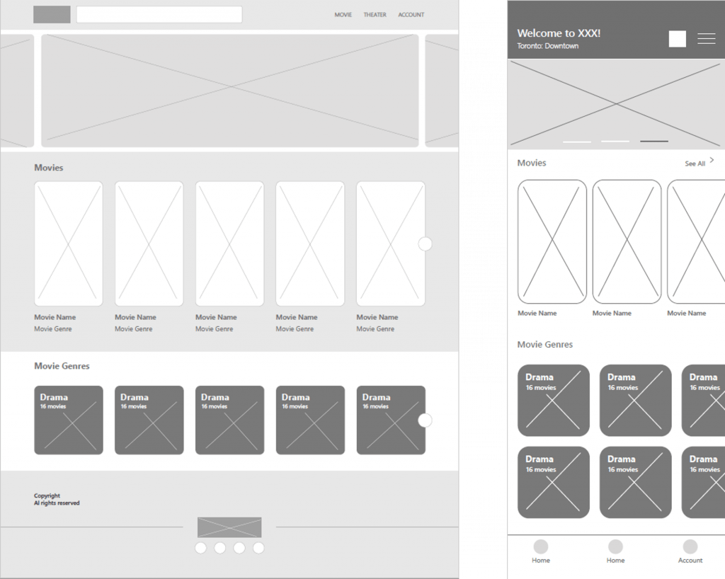
Because BookMySeat’s users access the site on a variety of different devices, I started to work on designs for additional screen sizes to make sure the site would be fully responsive.
Digital wireframes
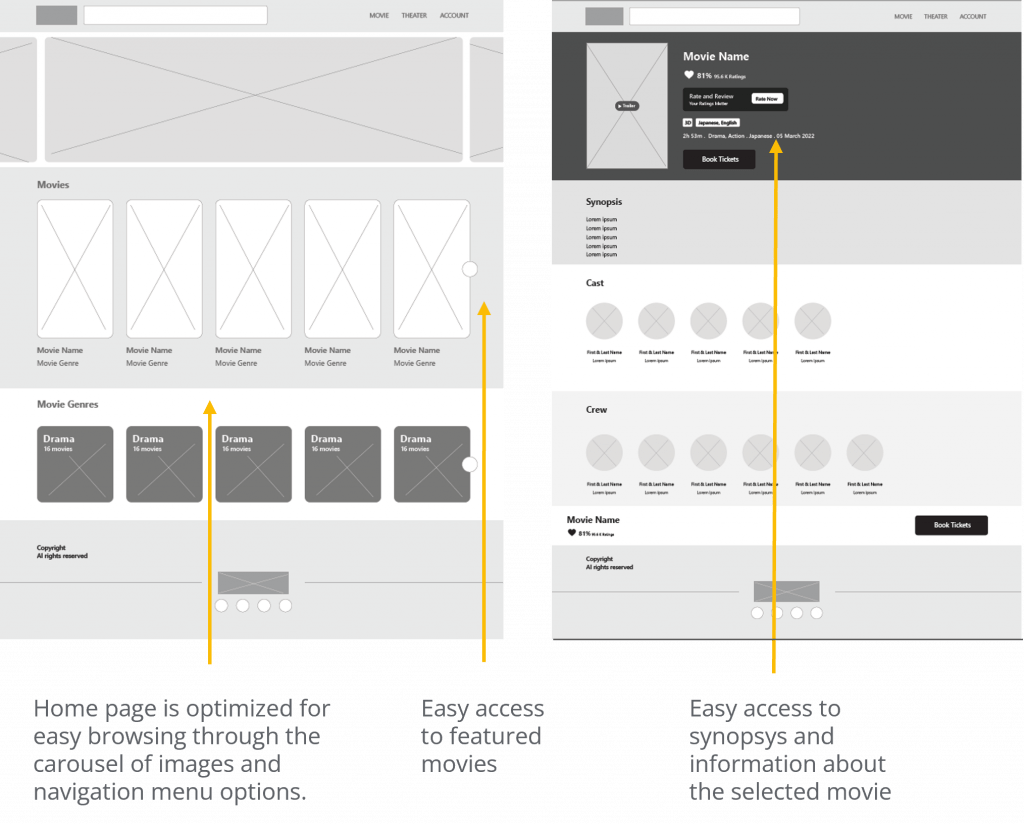
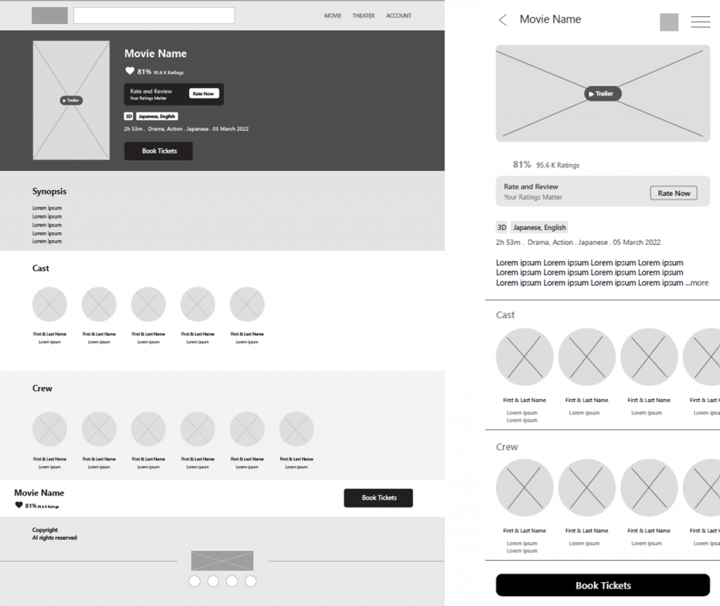
Moving from paper to digital wireframes made it easy to understand how the redesign could help address user pain points and improve the user experience. Prioritizing useful button locations and visual elements placement on the home page was a key part of my strategy.
Digital wireframe screen size variations:
Home page
Movie Information Page
Low-fidelity prototype
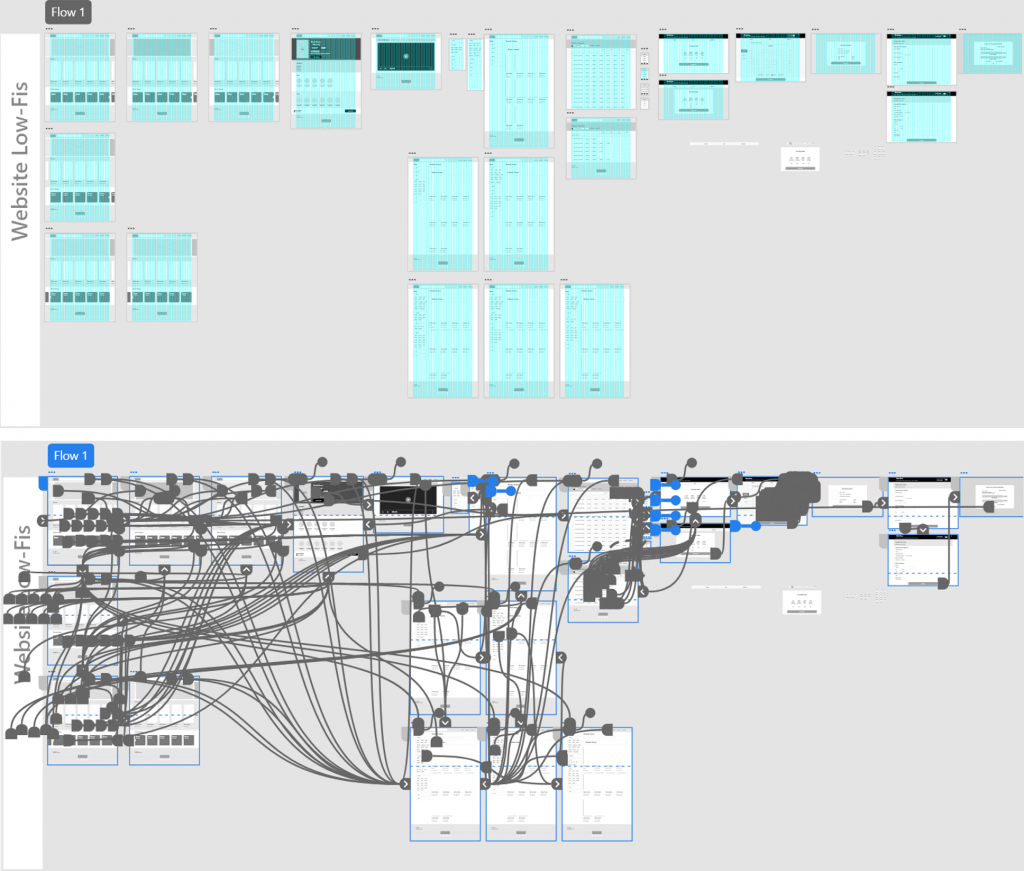
To create a low-fidelity prototype, I connected all of the screens involved in the primary user flow of selecting a movie, reserving the seat, and checking out. At this point, I had received feedback on my designs from peers about things like placement of buttons and page organization. I made sure to listen to their feedback, and I implemented several suggestions in places that addressed user pain points.
Usability study: parameters
Unmoderated usability study
5 participants
Canada, Toronto, remote
20-30 minutes
User research: pain points


Mockups
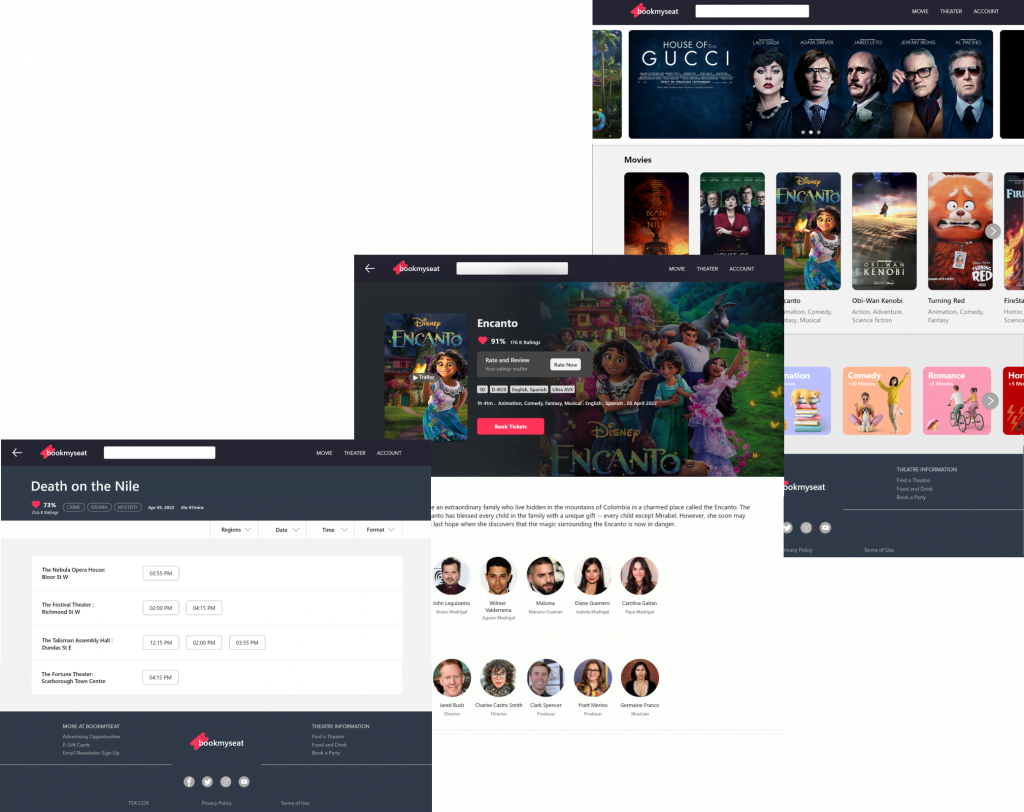
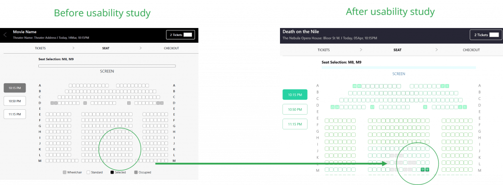
Based on the insights from the usability study, I made changes to improve the seat reservation flow. One of the changes I made was adding the numbers to the seats which are revealed while the user hover over the seats or select the desired seat. This helped users in the process of reservation.
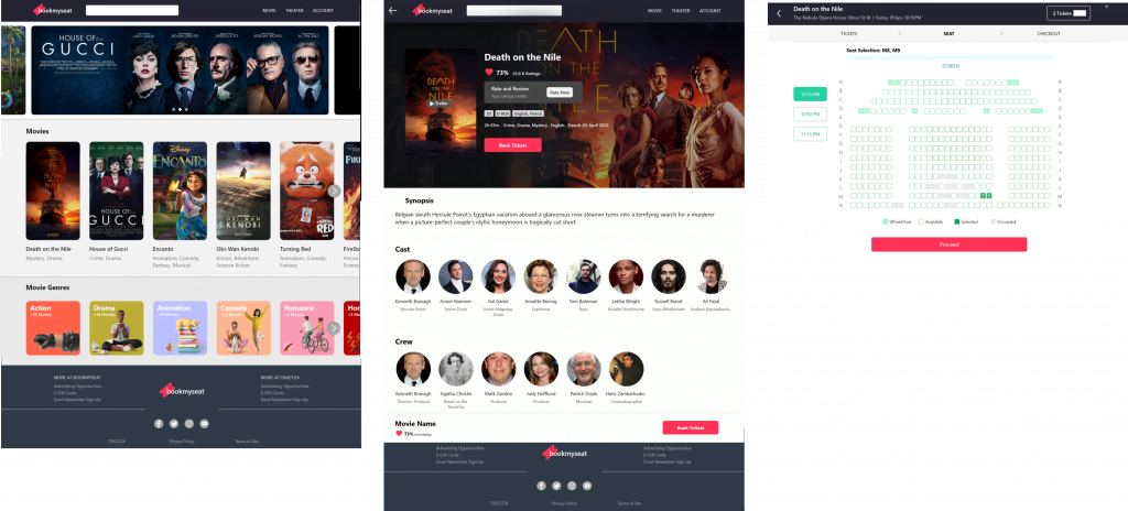
Based on the insights from the usability study, I made changes to improve the navigation of all pages. The steps I took was simply adding the back button to the top left of all pages through which users could be able to navigate to the previous page.

Mockups: Screen size variations
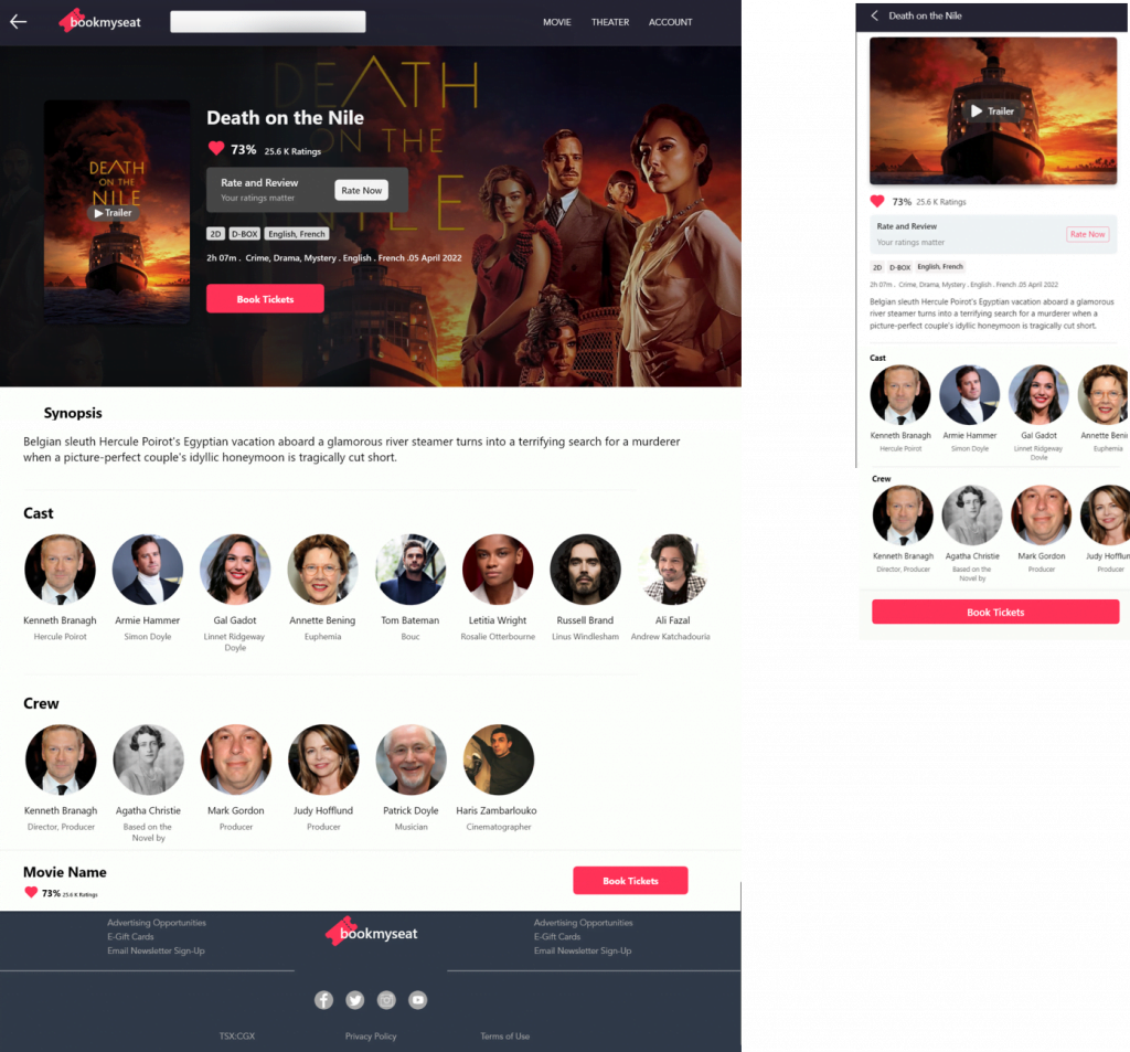
I included considerations for additional screen sizes in my mockups based on my earlier wireframes. because users book movie from a variety of devices, I felt it was important to optimize the browsing experience for a range of device sizes, such as mobile and tablet so users have the smoothest experience possible.

the movie information page
High-fidelity prototype
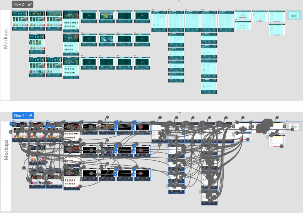
My hi-fi prototype followed the same user flow as the lo-fi prototype, and included the design changes made after the usability study, as well as several changes suggested by peers. View the BookMySeat’s high fidelity prototype.
Accessibility considerations


Takeaways
These were the main findings uncovered by the usability study:
Our target users shared that the design was intuitive to navigate through, more engaging with these images, and demonstrated a clear visual hierarchy.
I learned that even a small design change can have a huge impact on the user experience. The most important takeaway for me is to always focus on the real needs of the user when coming up with design ideas and solutions.
Next Steps


Thank you for reviewing my work on the bookmyseat page!
