Project overview
- A cross-platform Website to help kids learn about nutrition
- A corresponding App
8 weeks
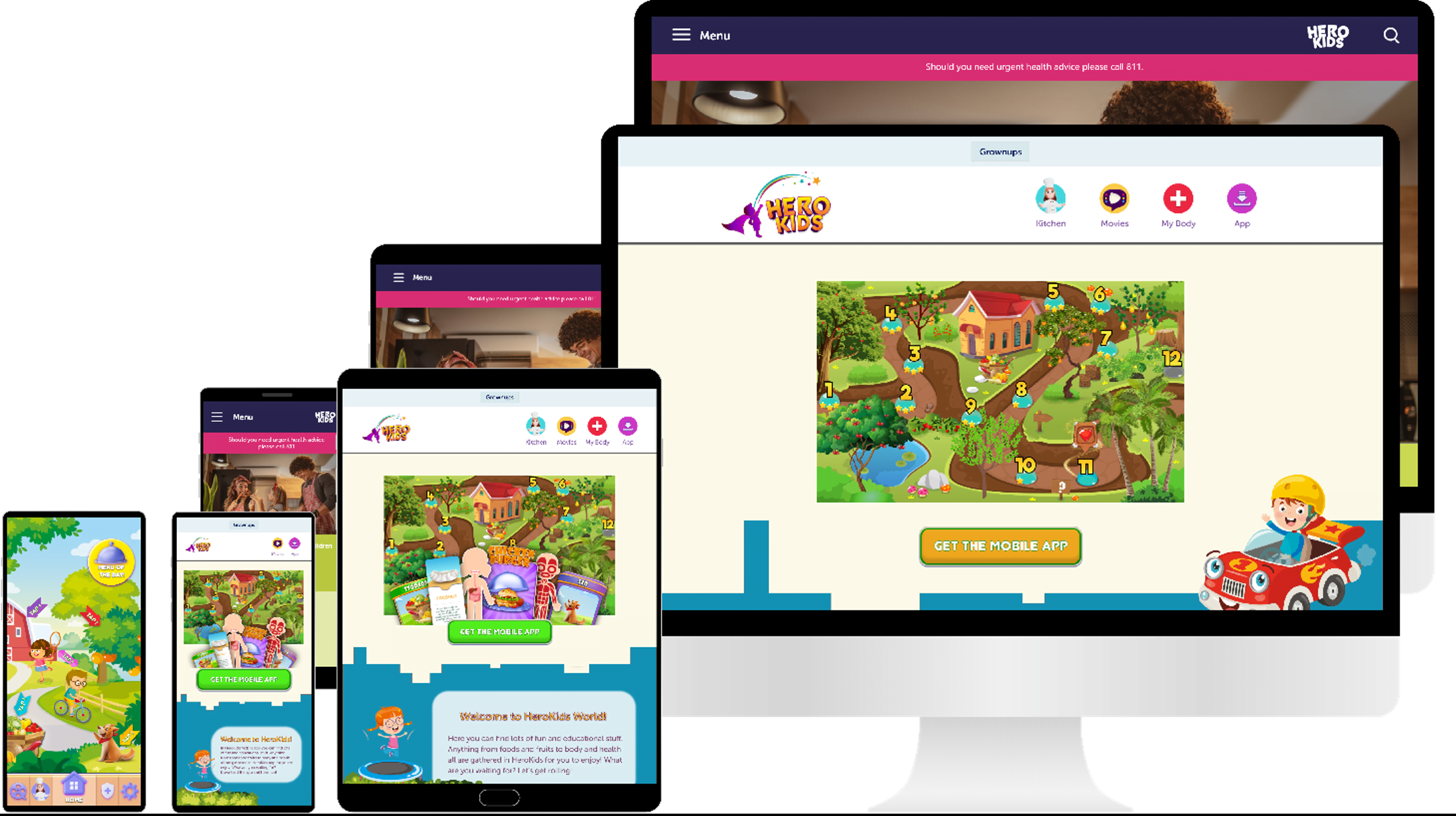
A mobile app and a responsive website for kids to learn about nutrition, along with the complimentary responsive website for adults to supervise their children’s nutrition.
8 weeks

A healthy diet and a healthy lifestyle are the key for lifelong healthy living but many adults don’t have good nutrition knowledge or enough time to help their kids learn about nutrition. This cause the growing of many diseases like obesity, Type 2 diabetes,.. among kids.
Create a non-judgmental nutrition platform tutoring kids about nutrition and encouraging them to make healthier choices. Along with it there is a need to help the parents update their knowledge about their children’s’ nutrition.
UX designer, UX researcher, UI designer, Visual designer
• UX Research: empathize, define, ideate
• Create wireframes and low-fidelity prototypes
• Create mockups and high-fidelity prototypes
• Design a complimentary responsive website
• Synthesize research results and iterate on designs
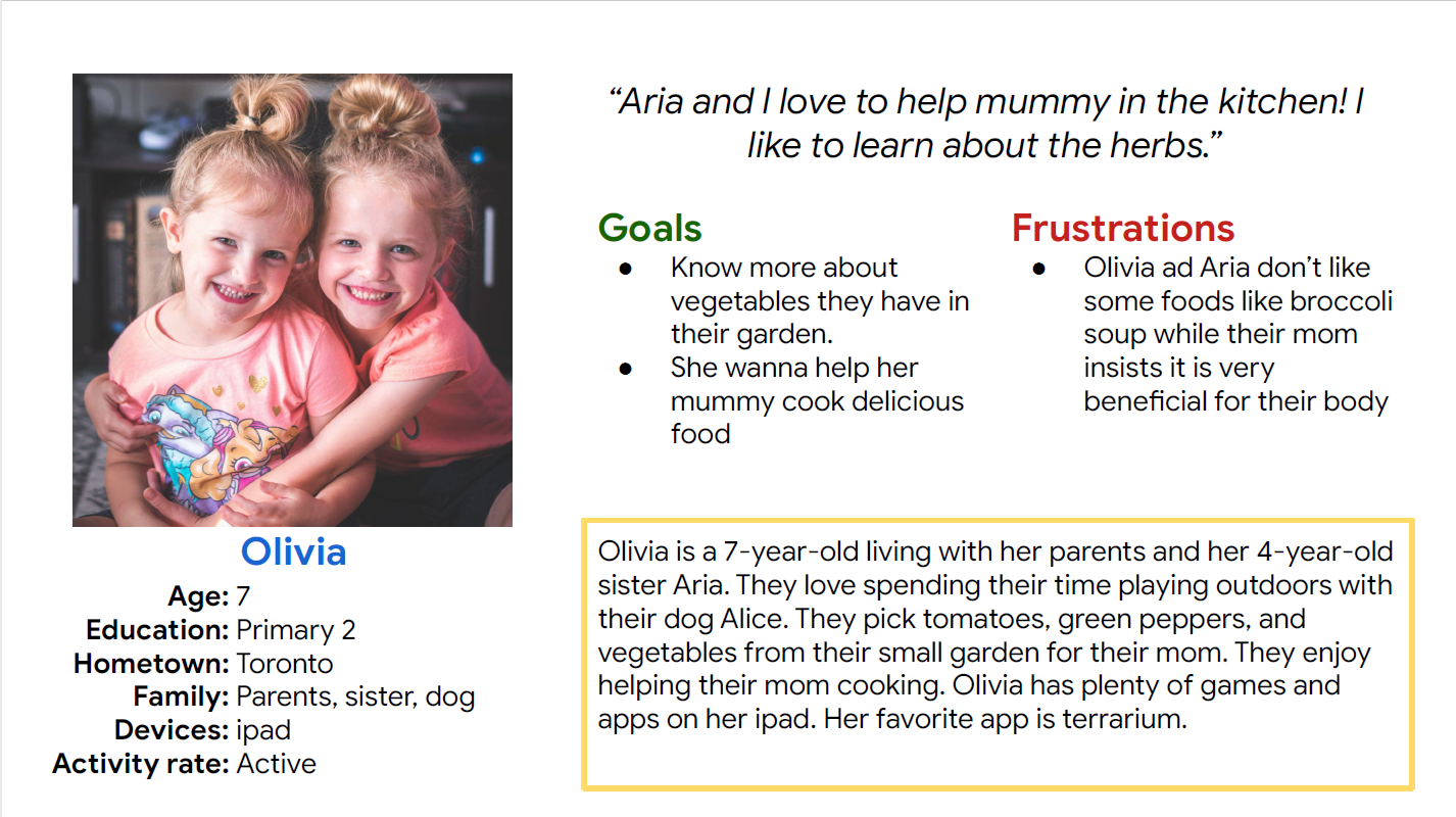
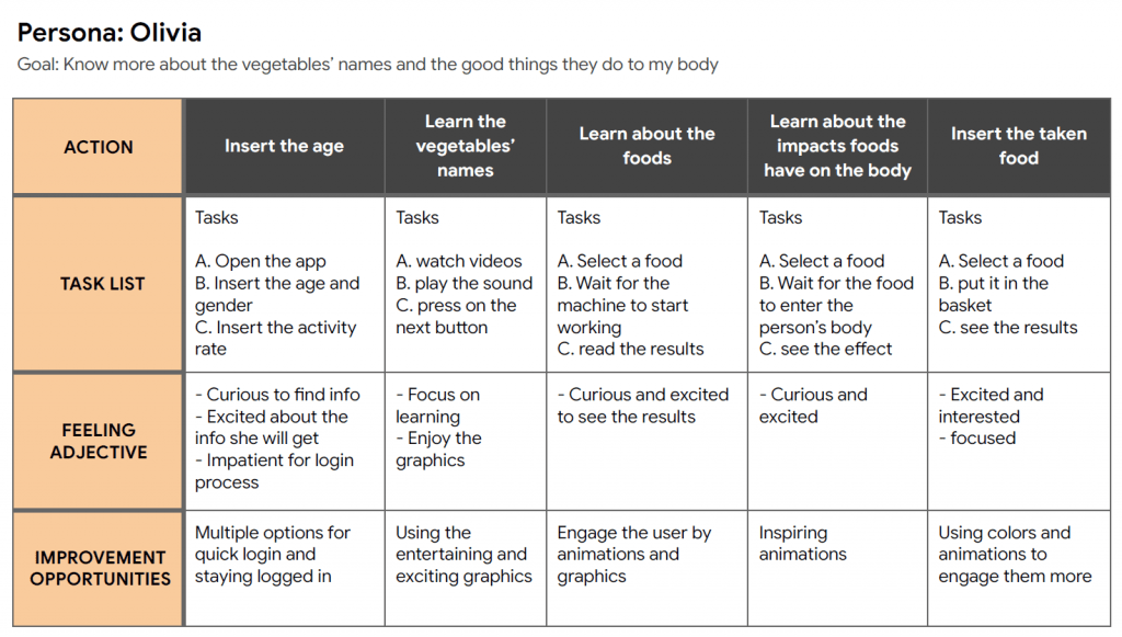
The interviewees were kids who were guiding by their parents. The interviews were focused on what is the kids attitude towards healthy eating and what is their knowledge of nutrition. I wanted to discover if there were any games, applications, or programs already in use. It was also important to find out what digital medium users use. Their parents answered to a few complimentary questions about how the above-mentioned programs work and if they didn’t, then why. They also provided me with information about if their children are picky eaters, if they have any struggles with them eating the specific food, and the overall eating habits of their kids.
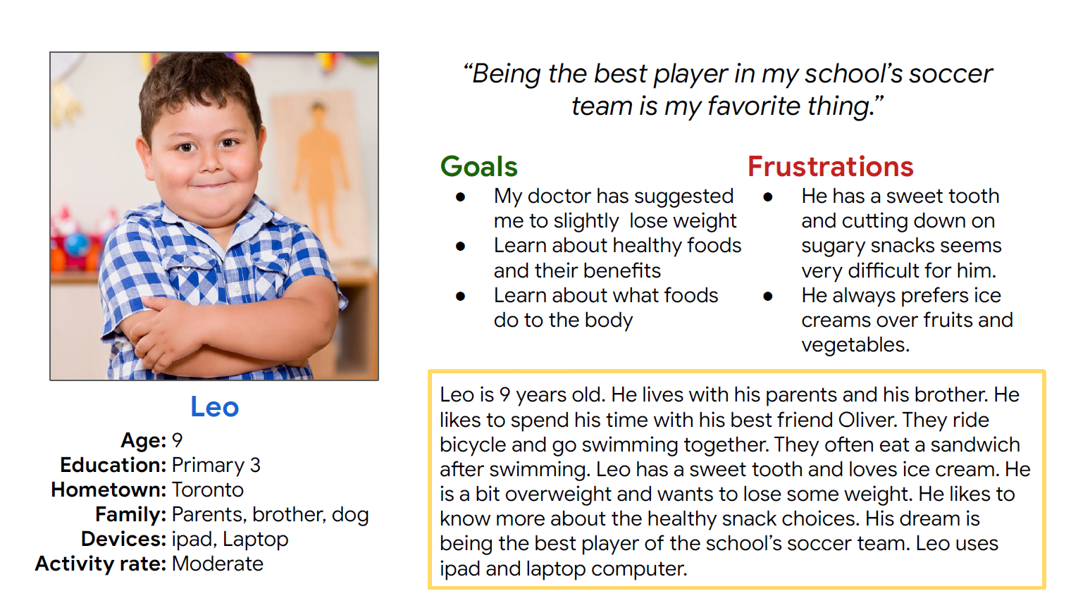
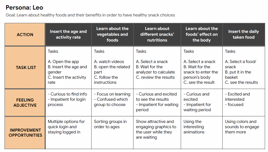
Leo is a 9-year-old boy who needs to find a way to learn about the foods and how to choose healthy snack because he wants to be the top soccer player of the school’s team.
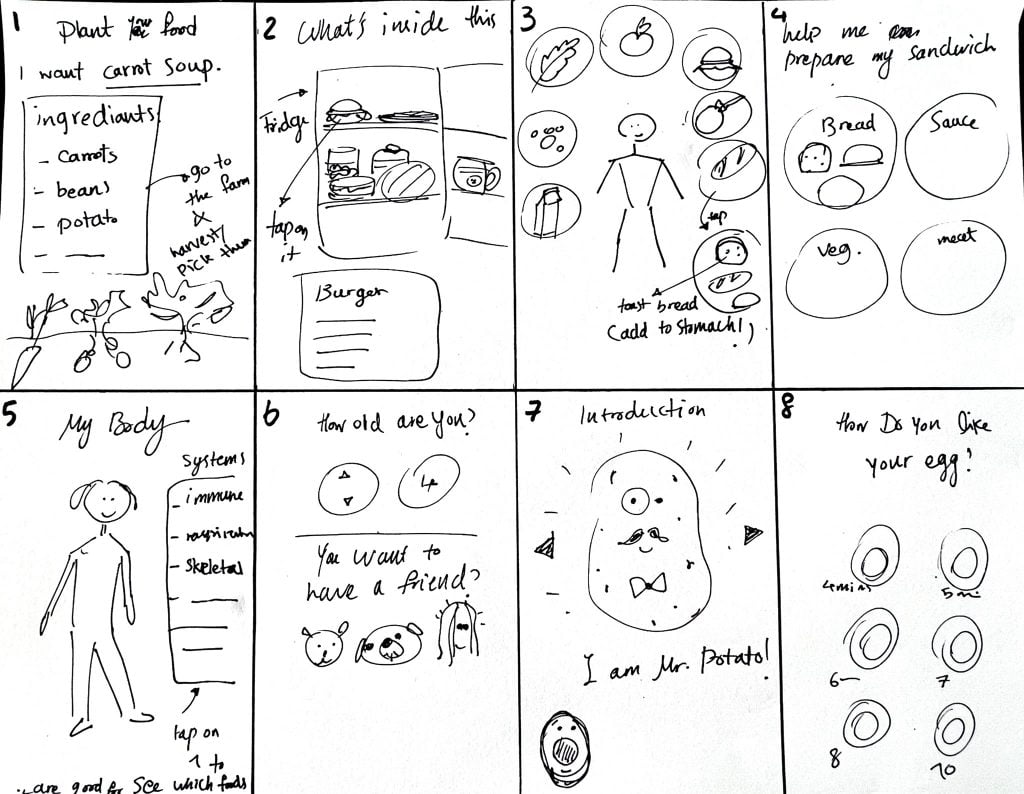
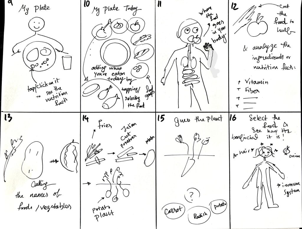
The ideation process helped me have a more distinct yet basic idea of what to design, but before jumping to Adobe XD, I created multiple sketches of the home page, selecting the best parts to create one last sketch, moving then to the digital wireframes.
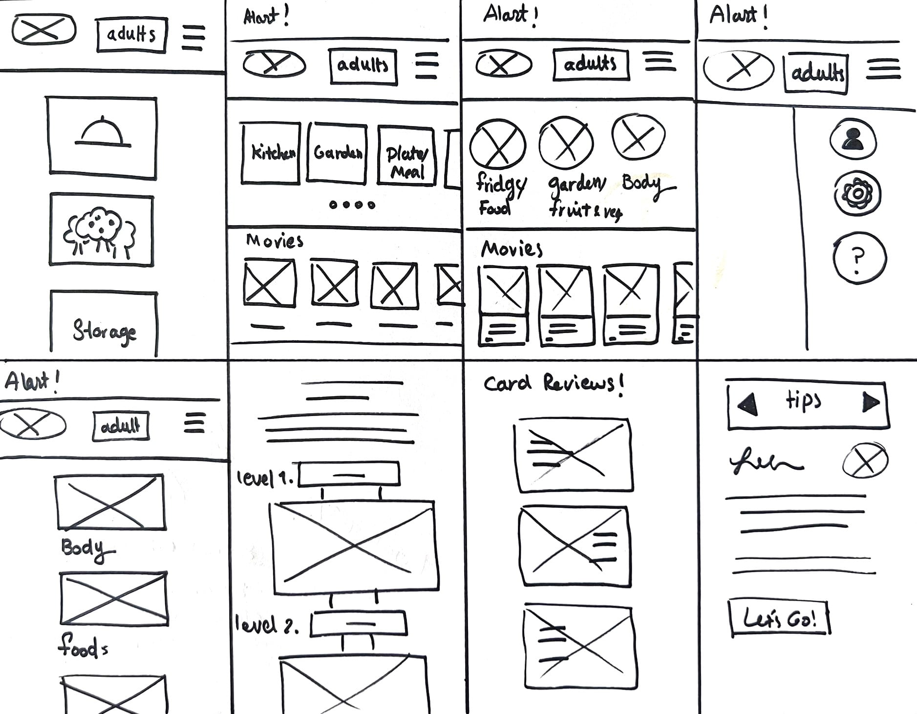
The main sections I designed:
My Body: Describes the relation between body and foods.
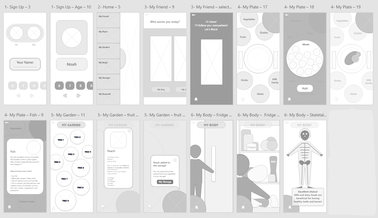
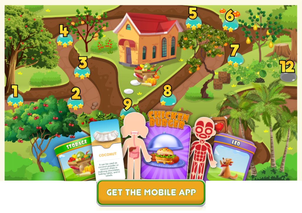
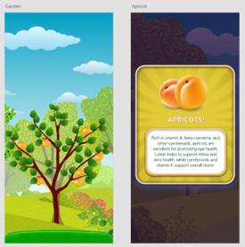
My Garden: Discover new fruits and vegetables and become familiar with the nutrition facts about them.
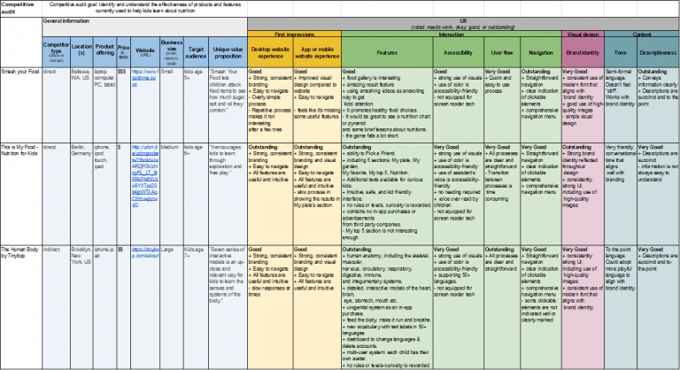
The main intent for using this app for kids is learning about nutrition. Therefore, I checked several platforms and games to see how kids interact with them.
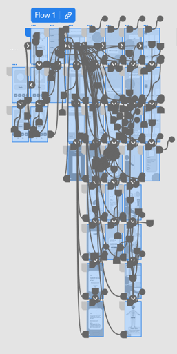
To prepare for the usability testing, I created a low-fidelity prototype.
Below you can find the link:
Moderated usability study
Toronto, Canada, remote (participants will go through the usability study in their own homes)
5 participants used the app and performed an activity on each of the 3 learning sections (My Plate, My Garden, My Body)
Each session will last for 15-20 minutes including the test and interview questions
I gathered the data and created affinity diagrams in order to discover the patterns and come up with the insights.
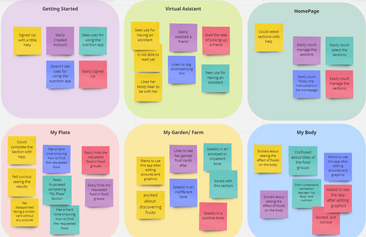
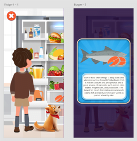
Based on the theme that: it is difficult for kids to select a food item from the food groups without the help of visual elements, an insight is: the users need strong triggers and infographics.
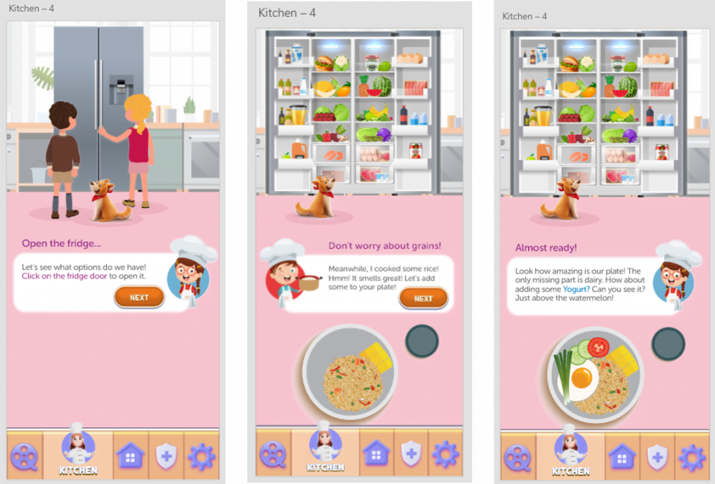
Based on the theme that: for most users it is very helpful to have a virtual assistant accompanying them throughout their journey, an insight is: there should be a virtual friend accompanying them with more detailed instructions.
Based on the theme that: saving the users’ achievements is inspiring for some users, an insight is: there should be a section to store the users’ discovered items in the garden.
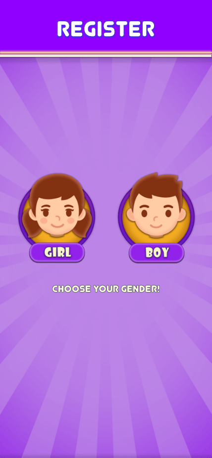
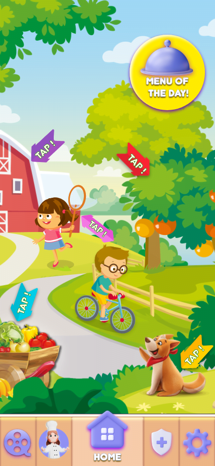
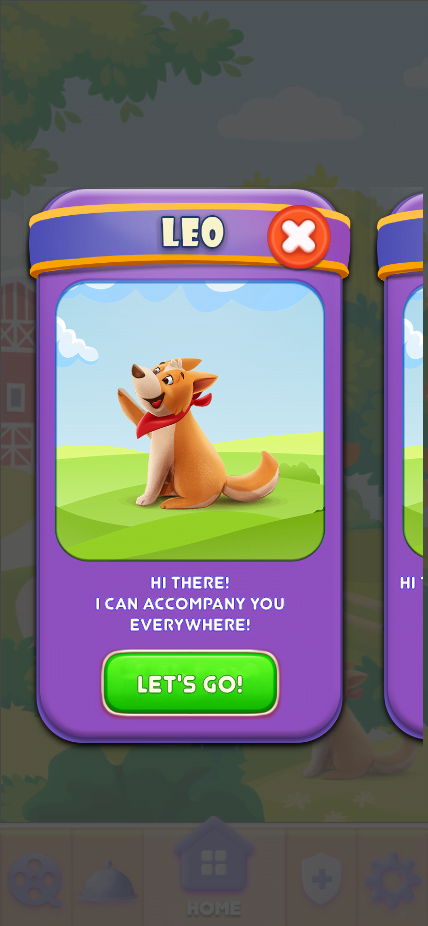

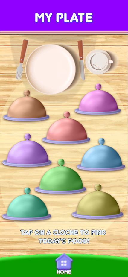
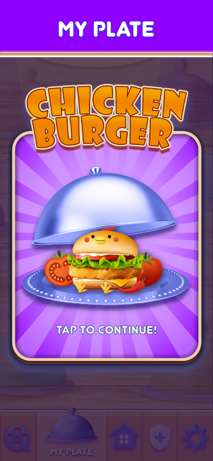
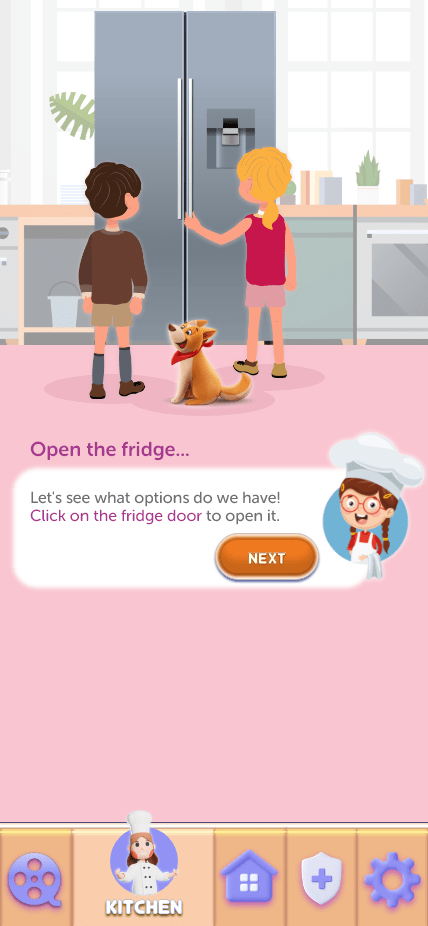

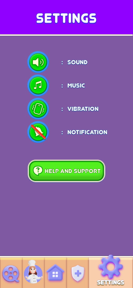
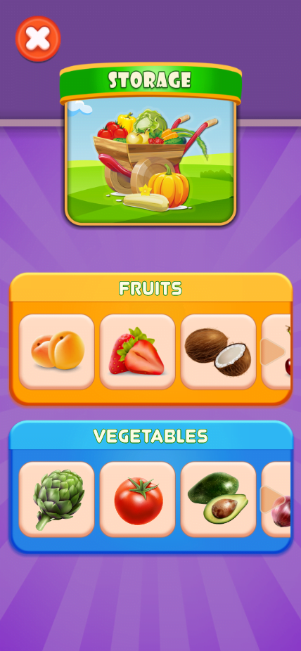
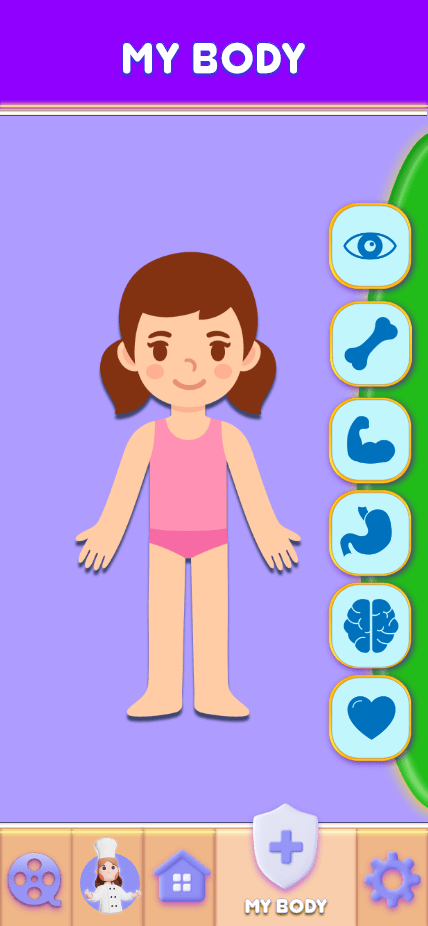
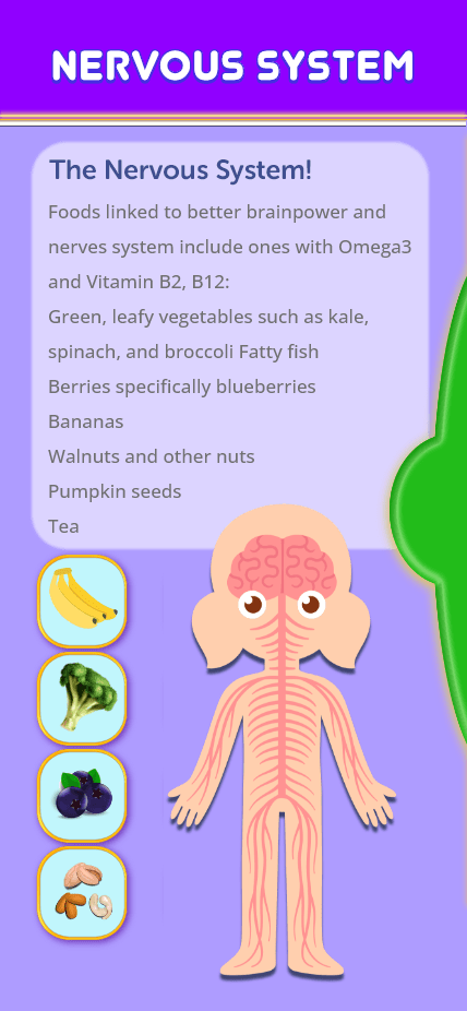
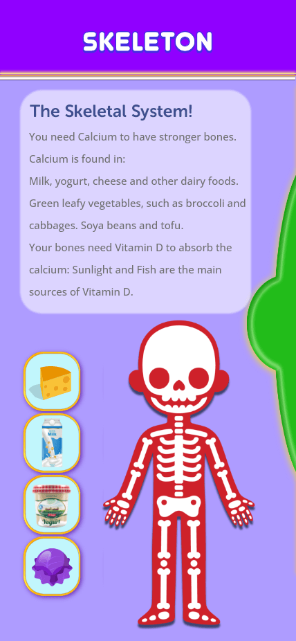
It was difficult for kids to go through the flow in the garden with the previous design. The frustrations were mainly around deciding what their next step was.
Changing the map so that the steps could be more expressive and clearer to guess and follow.
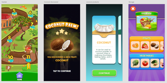
Adding a section called My Storage to save the users’ discovered items in the garden.
It was difficult for users to get the head out of the flow of the steps without detailed instructions.
Using a virtual friend, mentoring and guiding the user in completing the steps of the main flow
Here you can find the link to the high-fidelity prototype.
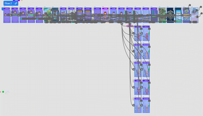
Sequential heading structure along with help of colors let me structure the content by splitting information out into different sections. Therefore, sighted users scan the page and find information quickly. Besides, they're essential for assistive technologies to be able to navigate a web page.
To have the most consistency in design, layout, and particularly in navigational controls , I positioned repeated navigation links in the same location on different pages, including home button, and using icons and control elements consistently.
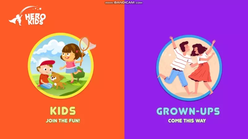
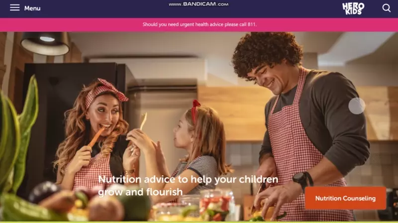
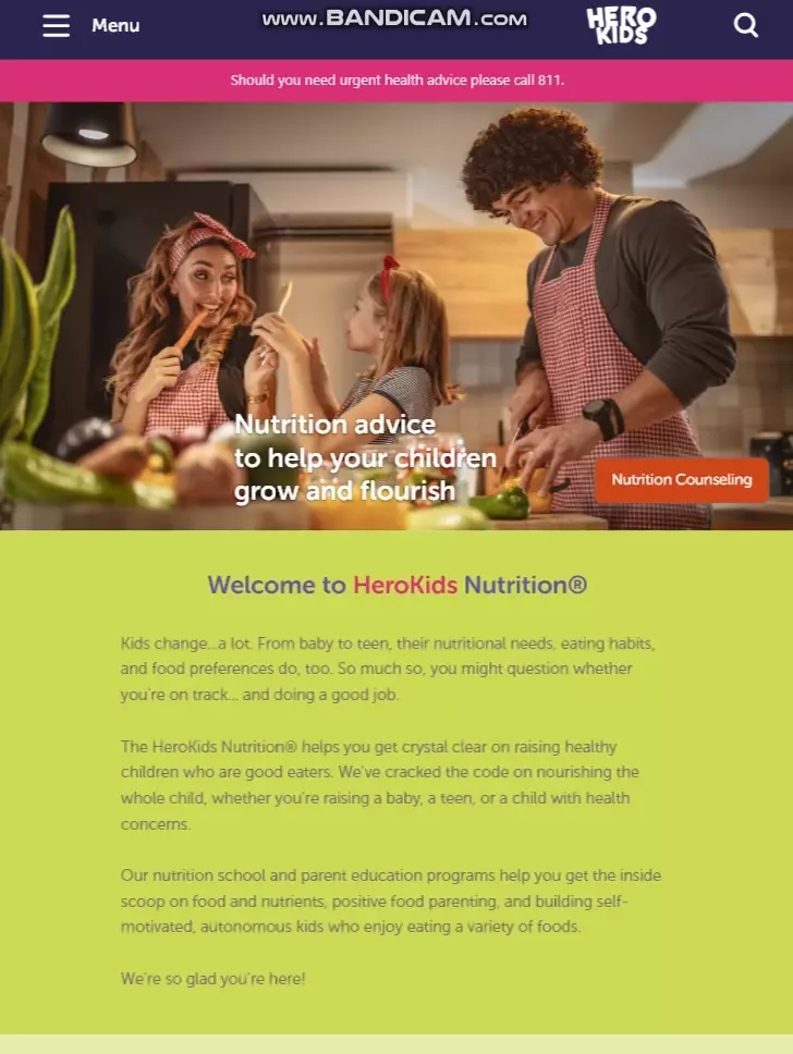
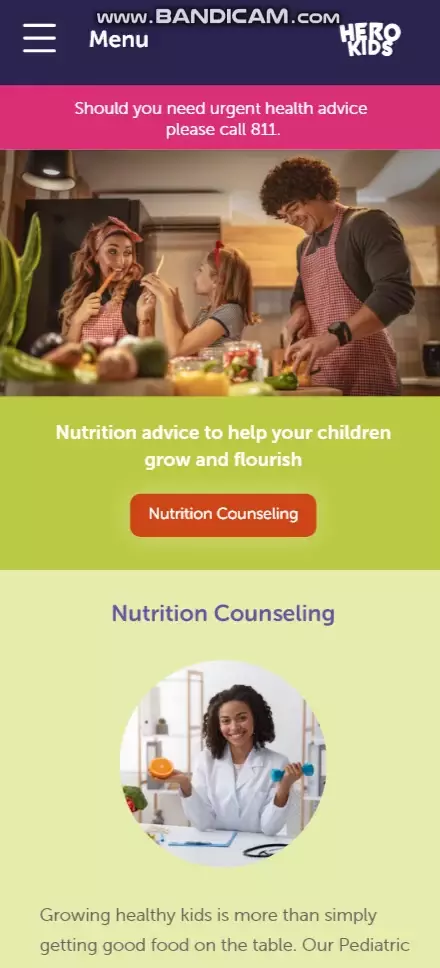
It was observed in the interviews that parents also have tendency towards using a nutrition website where they can have access to nutrition articles about kids. Alongside with this, kids are more willing to browse the website on the tablet or use the mobile app. Meanwhile, the parents are the target users of the desktop version and mobile version of the website. Therefore, I decided to design the website for both user groups and I used the split screen layout for my landing page.
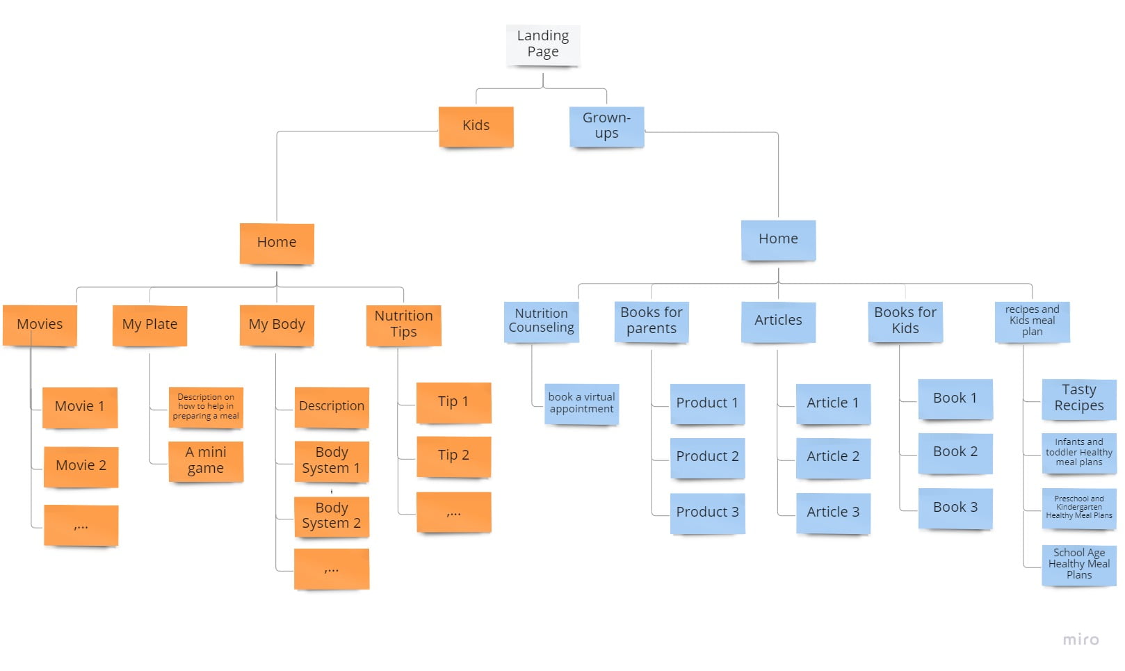
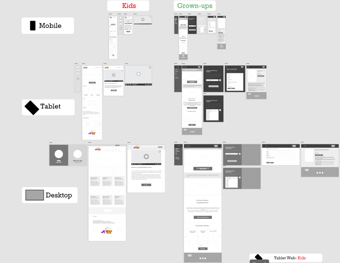
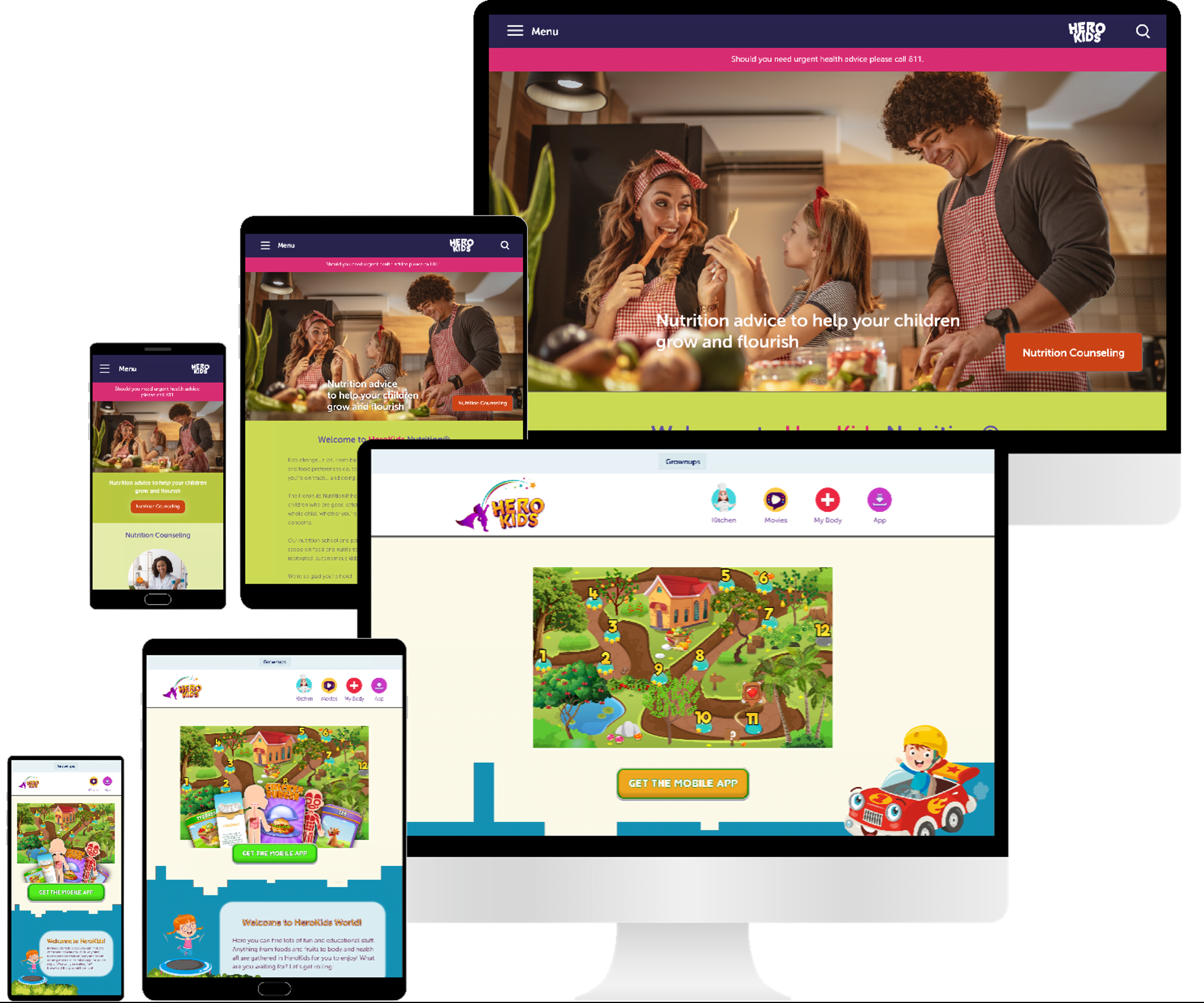
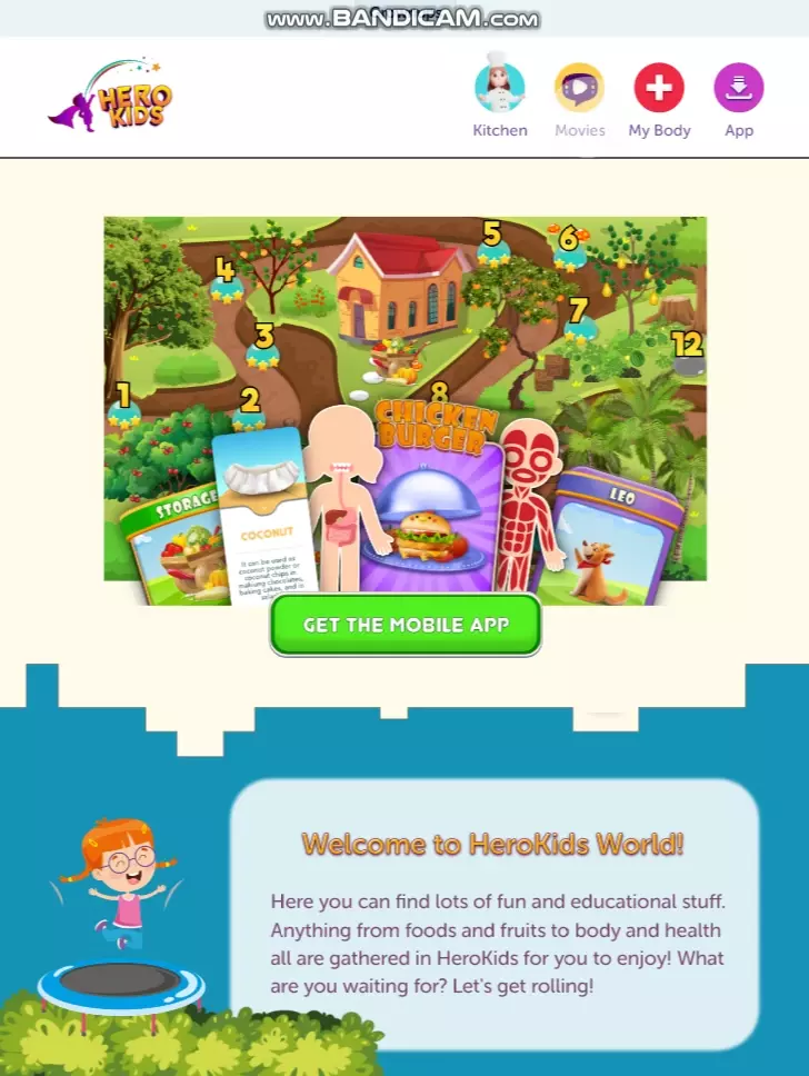
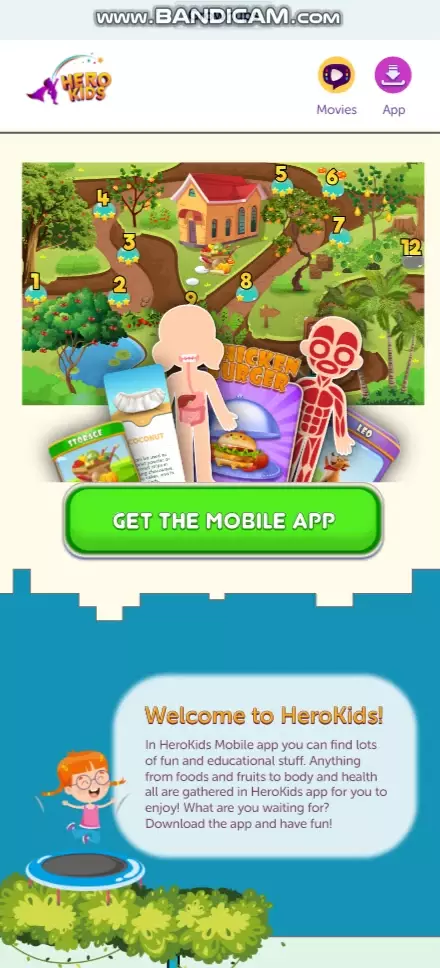
I designed the website for two user groups: kids and their parents. The responsive website is designed for three different screen sizes: desktop, tablet, and mobile.
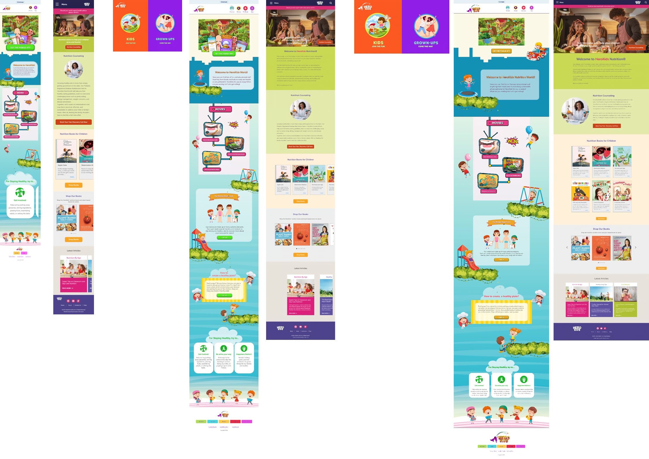
Although I had designed the assets from the scratch for the HeroKids app, I managed to design a new set of assets for responsive website. I used the colors and design style in the app so that the website could be in harmony with the app. However, I optimized the elements to fit the specific user needs of each device.
These are the links to:
It is one of each society’s desires to grow healthy generations. Whereas, it is not easy for kids to learn about nutrition. This platform fills the void for nutrition learning and increases passion among kids to have more healthy choices. Meanwhile, it offers good services for the parents better supervise their children's’ healthy nutrition.
I learned to eliminate my bias in the design process. Empathy is required throughout the whole UX design process.